 KPI chart settings
In edit mode, double-click a widget or hover over a widget and click Edit  .
.

You can make the following settings:
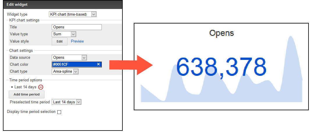
- Title. Title of the KPI chart. It is displayed centered in a predefined font size. Leave the field blank if you do not want to display a title.
- Value type. Define the output type of your data source.
- Sum. Sums up the data of the selected data source. (Example: A total of 955,000 messages were opened.)
- Average. Calculates the average of the selected data. (Example: An average of 120,000 messages were opened per day.)
- Minimum. Displays the lowest value of the data source of a day within the selected time period. (Example: The minimum number of open mails is 465.)
- Maximum. Displays the highest value of the data source of a day within the selected time period. (Example: The maximum number of open mails is 511,000.)
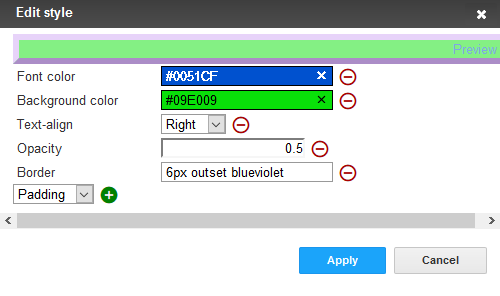
- Value style. Define the style in which the key figure is to be displayed. Click Edit and in the Edit Style window, select the property you want to edit from the drop-down list. Click Plus
 to add the property to the style set.
- Font color. Define the font color by entering a hexadecimal value preceded by
#(for example#000000). Alternatively, you can specify a color value using the color selector. - Opacity. Set a value between
0and1for the opacity of the key figure. - Background color. The background is displayed in the form of a colored stripe behind the key figure. Define the font color by entering a hexadecimal value preceded by
#(for example#000000). Alternatively, you can specify a color value using the color selector. - Text-align. Place the key figure on the left, centered or to the right of the widget. By default, the key figure is centered.
- Border. In the text field, enter a CSS standard frame definition, such as
2px dotted orangefor a 2 pixel wide, orange dotted frame. - Padding. Specify a pixel value to change the vertical position of the key figure, for example,
20px(the higher the pixel value, the lower the position of the key figure). - Font size. The font size is calculated automatically. Changes do not affect the output.
- Font color. Define the font color by entering a hexadecimal value preceded by
- Data source. Select the KPIStands for "key performance indicator" (also known as a conversion goal); the measurement of actions on web pages. The actions can be completed purchases, pages visited, time spent on site and so on. you want to create a KPI chart for. The KPIs are absolute values and refer to the messages stored in your client.
- Recipients. Number of recipients to whom messages are sent.
- Clicks. Clicked Links.
- Opens. Opened messages.
- Responses. Messages that return to the sending mail server (including reply, autoresponder, hard and soft bounce).
- Unsubscribes. Registered unsubscribes.
- Chart color. Color of the chart displayed in the background of the KPI chart. Define the font color by entering a hexadecimal value preceded by
#(for example#000000). Alternatively, you can specify a color value using the color selector.For better readability, the diagram color is slightly transparent. This results in color changes (for example red becomes pink).
- Chart type.
- Area-spline. Line chart with rounded corners and colored area.
- Area. Line chart with colored area.
- Line. Line chart.
- Spline. Line chart with rounded corners.
- Time Period Options.
- Add Time Period…. Add a custom time period.
- Title. Enter a name for the newly created period.
- Type. Select whether you want the time period to be absolute or dynamic.
- From/To (Absolute). Specify a start date and an end date.
- From/To (Dynamic). Starting from the current date, specify a time period in days. Use minus values to go back in the past.
- Click Minus
 to remove periods from the selection.
 - Preselected time period. Specify which period is to be displayed by default.
- Display time period selection. Show or hide the drop-down list for time period selection in the Performance Dashboard overview.