 Creating and editing report templates
Your account includes one or more descriptive report templates, with which you can analyze the main characteristics of your mailings. You can also create your own report templates.
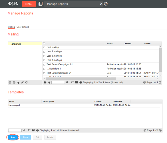
- To create a new report or report template, open the start menuMain screen in Optimizely Campaign, where the available options are grouped together. and select Analytics > Reports. The Manage Reports window appears.
- In the Templates area, click New.
To edit a report template, in the Templates area, click the template you want to edit then Edit.
To open an already executed report template, click the tab User defined on the upper left, next to Mailing.
- In the Title box, enter a significant name for the new report.
- To use a report as template for other mailings, check the Template box.
- In the Type of chart list, select how the report data will be displayed:
- Aggregated. Selected indicators are displayed as aggregated numbers. For example, the total number of clicks or the total open rate within a time period.
- Time elapsed. Indicators are displayed per hour, day, week, and month.
- Click Chart.

The Create Chart window opens.
Selecting measures and mailings
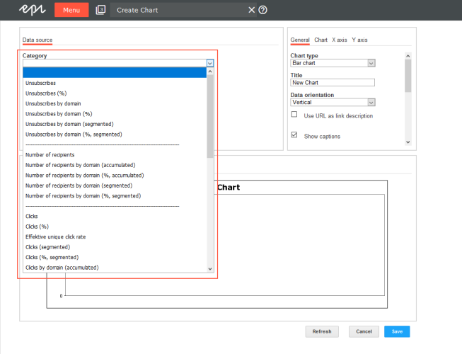
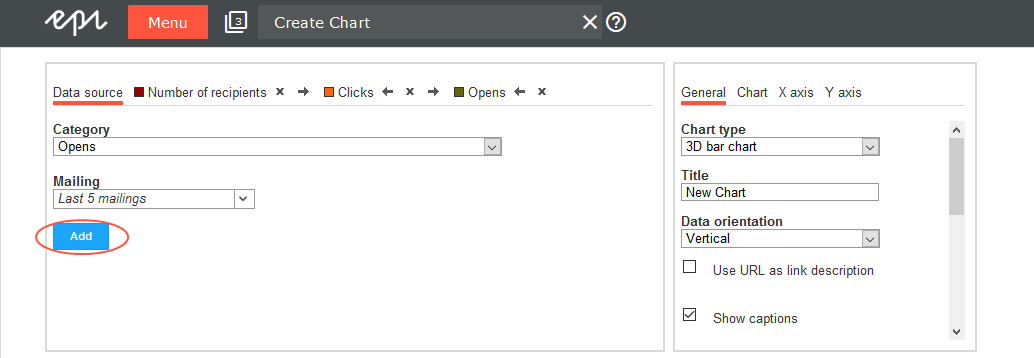
- In the Data source area > Category drop-down list, select the measure you want to analyze.
You can use the following measures for your report:
- Unsubscribes
- Number of recipients
- Clicks
- Opens
- Returned emails
- Post Click — if your client is set up accordingly
These measures can be shown in the following configurations:
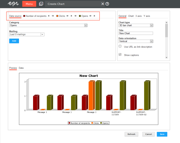
Configuration Description Absolute Total number of clicks, opens, and so on. The indicator is called Clicks or Opens. As a percentage The information is provided as a percentage. Based on domains (cumulative) Displays how many events (clicks, and so on) were activated by recipients whose email addresses indicate a specific domain (such as example.com). In this way, you can recognize how many active recipients are from various providers. Based on domains as a percentage (cumulative) Same as above, but as a percentage. Based on domains (separated) Divides the display of measured events based on the recipient email addresses. Based on domains as a percentage (separated) Same as above, but as a percentage. By profile This option is only available to display the clicks by click profile. Unique or total clicks can be displayed. A unique click in a profile means that the recipient has clicked once on any link in this profile. Several unique clicks on different links of that profile produce only one unique click in the profile. - For each measure that you add, a tab is displayed in the upper area of the window next to Data source. Click this tab to make additional settings for each measure, such as changing the bar name or color.
Depending on data source, more options are available, such as limiting the links to be tracked when counting clicks.
- To remove a measure, click the x on the tab.
- To change the arrangement of bars in the chart, use the arrows on the tabs to move them right or left. You can change the order of the bars in the same way.
- Click the Mailings list, then select check boxes next to mailings you want to analyze. If you select more than one mailing, the results are compared in the same chart. Click OK when finished.
- Click Add. In the Preview tab, a bar with the respective data is displayed.
Configuring charts
In the right area of the window, you can define the chart type you want to use and labels, size, and background color. Afterwards, click Refresh to see how your settings affect the graph and table view then click Save.
You have the following options to customize your charts:
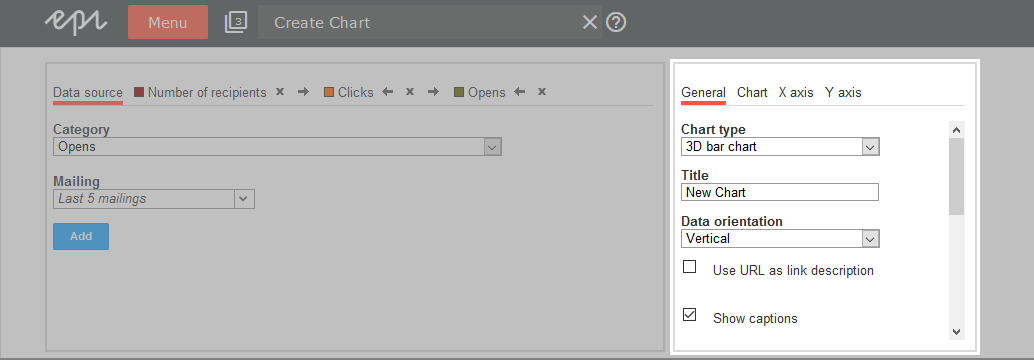
General
| Option | Description |
|---|---|
| Chart type |
Click the chart type you want to use:
|
| Title | Enter the chart title. |
| Data orientation | Display the table in the Data tab horizontally or vertically. |
| Use URL as link description | Display links with their URL, to reveal what is behind each link. |
| Show captions | Show or hide captions. |
| Width, Height, Transparency, border color | Define the chart's layout further. |
| Show border, Border color | Select to frame the chart. |
Chart
The Chart tab lets you customize the layout of your chart:
| Option | Description |
|---|---|
| Orientation | Display the chart horizontally or vertically. |
| Background color | Select the background color. |
| Chart border color | Select the frame color. |
| Show bar border, border color | Select to frame each bar of the chart. |
| Caption orientation | Displays captions of the bars horizontally or vertically. |
X axis
| Option | Description |
|---|---|
| Show | Show or hide the X axis. |
| Title | Enter a title for the X axis. |
| Show grid lines | Show or hide the grid lines. |
| Grid line color, grid line style | Define the style further. |
Y axis
| Option | Description |
|---|---|
| Show | Show or hide the Y axis. |
| Title | Enter a title for the Y axis. |
| Show captions | Show or hide labels. |
| Axis marks |
Show or hide axis marks. |
| Show grid lines | Show or hide grid lines. |
| Grid line color, grid line style | Define the style further. |
Deleting a report template
To delete a report template, in the Templates area, click the report template > Delete.
Saving a new report
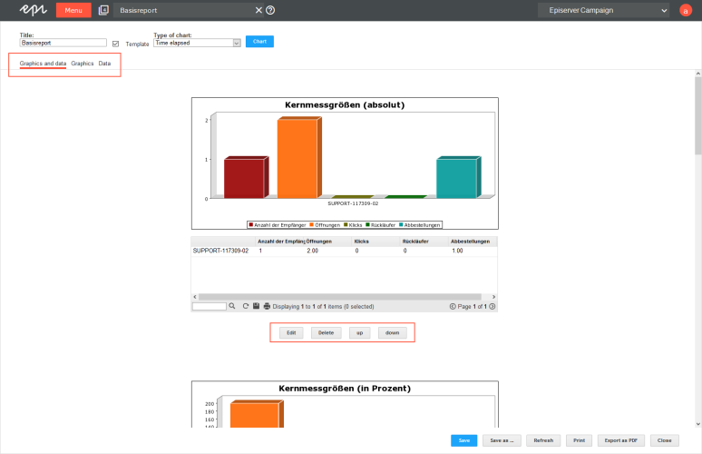
The New Report window displays analyses created for this report.
You can add any number of additional analyses to your report. Click Chart and create a new diagram as described under Selecting measures and mailings. Then, save the report template via Save or Save As to add the diagram to the report template.
For the Graphics and data tab, the complete analysis is shown (including images and text); for the Graphics or Data tabs, only those display formats are shown.
You can perform the following actions on every analysis:
- Edit. Change the settings.
- Delete. The analysis is erased from the report.
- Up. The analysis is moved up in the report.
- Down. The analysis is moved down in the report.
If one of the charts in the report is time-elapsed (option Type of chart), use the tabs over the chart to switch among hour, day, week, or month modes. With the Start date and End date fields, you can set the exact time period to be displayed. To recalculate the chart, click Apply . If Apply to all is clicked instead, the charts in the report are also recalculated based on the new time period.
To save the report, click Save.
