 Navigation menu
To enable this feature, contact customer support.
With the navigation menu paragraph type, you can create navigation bars with links to landing pages or deep links. And, you can add and edit menu items with no HTML knowledge.
Navigation menu example:

Range of functions
- Can design each menu item individually: Text and background color, as an image or with an icon.
- Create up to 10 menu items.
- Store up to five user-defined layouts and apply them to the navigation menu.
- In the mobile version, you can display navigation in two or three columns or as a hamburger menu.The hamburger menu offers the following advantages:
- simple/minimalistic; can be used almost anywhere in the layout
- navigation can be folded in and out
- space-saving display for small screens
Creating a navigation menu
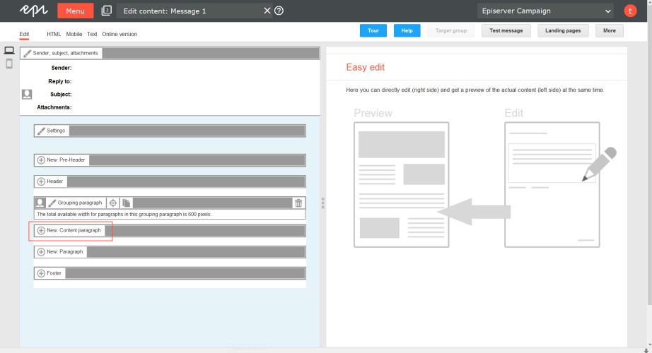
- While editing the mailing content in the Template Kit, click New: Content paragraph.A window for selecting the paragraph type opens on the right side.
You can also use the paragraph in the header and footer area by clicking Header or Footer.
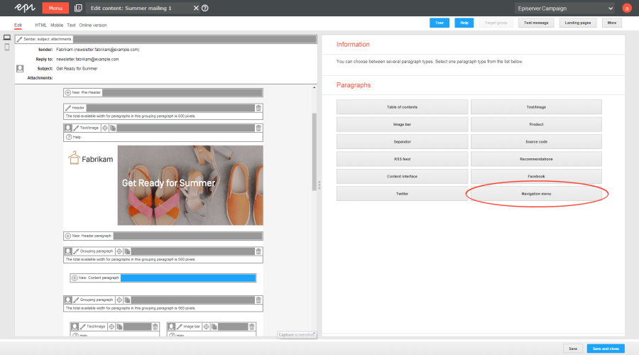
- Click Navigation menu. The configuration window for the selected paragraph type opens.
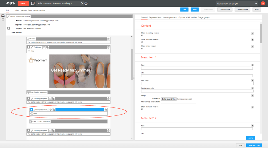
- Click Apply. The newly created navigation menu appears on the left, in the preview window.
Configuring a navigation menu
- Click Navigation menu on the left side of the preview in the menu bar of the navigation menu. The configuration window opens on the right.
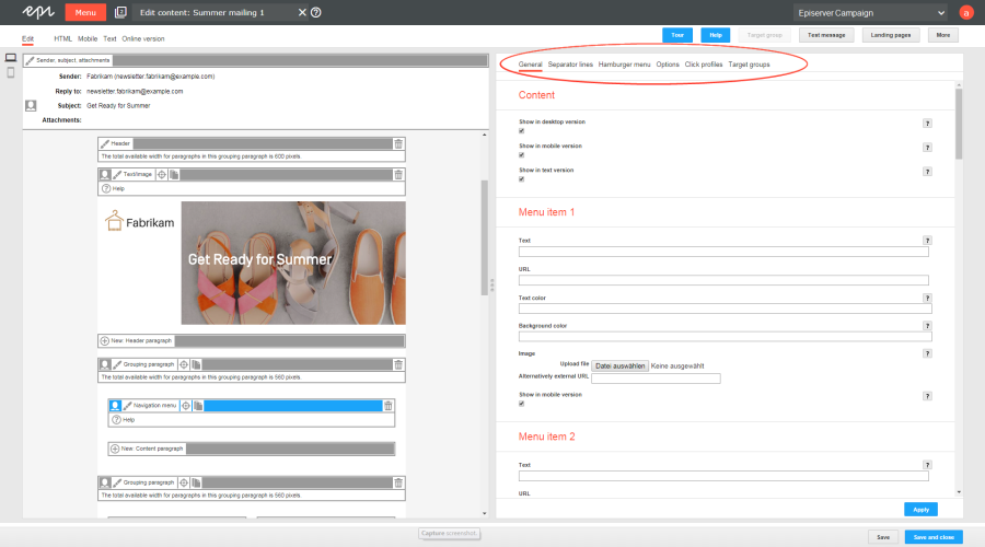
- See the following tables to set options in the corresponding tabs. Click Apply to confirm your settings.
General
| Parameter | Description |
|---|---|
| Content | |
| Show in desktop version | Select to include this paragraph in the desktop mailing. |
| Show in mobile version | Select to show the paragraph in the mobile version of the mailing. The Activate mobile version setting in the general settings must be activated for this option to take effect. |
| Show in text version | Select to show the paragraph in the text version of the mailing. |
| Menu item 1-10 | |
| Text | Enter the caption of the menu item. To use an image for the menu item instead of a caption, enter a caption anyway. In this case, the caption is used as the image's alternative text. You can display an image with or without a caption for the menu item. These settings are in the Options tab under Menu items > Image position. |
| URL | Enter a URL to which the menu item should refer. If a recipient clicks this menu item, he/she is directed to the specified URL. |
| Text color | Specify the text color for the menu item caption. If you leave the field blank, the text color specified in general settings > Menu items in the navigation menu > Font settings > Color is used. |
| Background color | Specify a background color for . The setting only affects the selected menu item. To use the same color for all menu items, configure a global background color. These settings are in the Options tab > Menu items > Background color. |
| Image | Upload an image. Click Browse... and select an image in the file browser. Alternatively, in the Alternatively external URL field, you can enter an image URL that refers to the image source. You can display the image together with or without the caption of the menu item. The corresponding settings are in the Options tab under Menu items > Image position. The image size of the uploaded image is not reduced. So, only upload images that match the size of the menu item. If you select a multi-column layout for the mobile version, before sending, use mobile preview to check if the navigation menu displays correctly with these settings. |
| Show in mobile version | Select to show the menu item in the mobile version of the mailing. |
Separator lines
| Parameter | Description |
|---|---|
| Content | |
| Show vertical separator lines in the desktop version | Select to insert vertical separator lines between menu items in the desktop version. |
| Show vertical separator lines in the mobile version | Select to insert vertical separator lines between menu items in the mobile version. |
| Show horizontal separator lines in the mobile version | Check this box to show horizontal separator lines between menu items in the mobile version. This option only takes effect if you are using the default layout and configure it so that menu items in the mobile version are displayed below each other (see the Options tab under Layout > Default layout). |
| Layout | |
| Thickness | Enter the thickness of separator lines between menu items in pixels (integer value) .If you leave the field blank, the lines are displayed with a 1 pixel thickness. To show no separator lines, enter 0. |
| Color | Enter the color of the separator lines. If you leave the field blank, the color you specified in the general settings in the Font settings tab under Menu items in the navigation menu > Color is used. |
Hamburger menu
To save space for display on smart phones and tablets, you can use a hamburger menu to reduce the navigation menu to an icon.Recipients can expand and collapse the navigation menu by clicking the icon.
The hamburger menu is only available for the mobile version. In addition, Google’s Gmail app does not support this feature and shows menu items expanded.
| Parameter | Description |
|---|---|
| General | |
| Display | Select to activate the hamburger menu in the mobile version of your mailing. |
| Menu bar | |
| Heading | Enter the caption of the hamburger menu. The caption displays next to the hamburger menu icon. |
| Padding | Configure the size of the menu bar by specifying the area around the hamburger menu symbol. Enter the value in pixels (integer values). |
| Background color | Enter the background color for the hamburger menu's menu bar. |
| Image | |
| Image | Upload an image to replace the menu bar label with an image. Click Browse... and select an image in the file browser. Alternatively, in the Alternatively external URL box, enter an image URL that refers to the image source. If the uploaded image is too wide for the menu bar, the image is adjusted to the maximum available width. |
| Alternative text | Enter an alternative text that displays if a recipient blocks the download of images, or the image cannot be displayed for any other reason. The alternative text should contains a brief description of the picture. |
| Link | Enter the URL of a landing page, beginning with the http:// or https:// protocol.If you already created a landing page for the mailing, a list of those landing pages appears. |
| Icon | |
| Position | Select the position of the hamburger menu icon. |
| Color | Enter the color for the hamburger menu icon. If you leave the field blank, the color specified in the general settings in the Font settings tab under Menu items in the navigation menu > Color is used. |
| Background color | Enter the background color of the hamburger menu icon. |
| Rounding contours | Check this box to round the contours of the hamburger menu icon. |
Options
| Parameter | Description |
|---|---|
| Layout | |
| Width | Enter at least 30 pixel width. The setting only affects the desktop version. If you leave the field blank, the paragraph is displayed across the entire width available in the mailing. If you want to change the available width in the mailing, open the general settings, open the General tab and make your changes in the Layout area. |
| Height | Enter the height of the paragraph in pixels. The setting only affects the desktop version. If you leave the field blank, the height will automatically be adjusted to fit the content of the paragraph. If you select a height that is insufficient for the content of the paragraph, the value you enter is ignored, and the height is adjusted automatically. |
| Alignment | Specify how to position the navigation menu. |
| Background color | Enter the background color of the navigation menu. |
| Padding |
Specify white space around the paragraph content. You can set white space separately for each page. Enter the values in pixels (integer values) based on the following example, using spaces to separate multiple pixel entries:
If the value is set to 0, then there will be no padding. |
| Layout | Select a layout for your navigation menu. You can select between the supplied default layout and up to five custom user-defined layouts. To use a user-defined layout, set it up in advance in the general settings in the Navigation menu tab. If you choose to enter a user-defined layout from the drop-down list that you have not configured, the default layout is used instead. See Navigation menu layouts. |
| Default layout | Select the arrangement of menu items for the mobile version of the default layout. If you use a custom layout, the option selected here is ignored. |
| Background image | |
| Image | To upload a background image that covers menu items, click Browse... and select an image in the file browser. In the Alternatively external URL box, you can also enter an image URL that refers to the image source. If you specify a background image, it is used instead of the selected background colors for menu items. Not all email programs and web mailers support background images. You should only upload background images that contain unimportant information. |
| Alignment | Specify how to position the background image. |
| Repeat | Specify whether and how the background image is repeated. |
| Menu items... | |
| Background color | Specify a global background color for the menu items. If you specify an individual background color for a menu item, this is used instead of the global background color. To use the global background color for a menu item, delete the color value in the General tab under Menu item # > Background color. |
| Width (desktop version) | Enter the width of the menu items in pixels. The recommended width for the menu items is shown in the preview on the left if you hover over ?Help. |
| Padding | Configure the size of the menu items by specifying the area around the caption. You can set each side of the area individually. Enter the values in pixels (integer values) based on the following example, using spaces to separate multiple pixel entries:
|
| Text alignment | Specify how to position the captions of the menu items. |
| Text position (next to the image) | Specify where to position captions of menu items next to an image. This option applies in the following cases:
|
| Image position | Specify whether and where the images next to the captions of the menu items are displayed. If you select Centered (no label), the stored caption is not displayed but is used for the image's alternative text. |
| Menu items (mobile version) | |
| Width | Enter the width of the menu items in percent. This option only takes effect if you use the default layout, and it is set so that individual menu items in the mobile version are displayed next to each another (see the Options tab under Layout > Default layout). |
| Text alignment | Specify how to position the captions of the menu items. |
| Text position (next to the image) | Specify how to position the captions of the menu items next to the image. This option applies in the following cases:
|
| Border | |
| Show | Select to add a border to the paragraph. Do not forget to specify a color for the border when you activate the option. |
| Border width |
Enter the thickness of the border. You can set thickness for each side individually. Enter values in pixels (integer values) based on the following example, using spaces to separate multiple pixel entries:
If you leave the field blank, the border has a thickness of 1 pixel (uniform on all sides). |
| Color | The depiction of non-hex web colors may vary from the original, depending on the browser. |
| Mobile... | |
| Width | Set the paragraph width (in percent; 100% default) for mobile view. To display paragraphs next to each another in mobile view, make sure that the widths of two consecutive paragraphs combine to 100%. Otherwise, the paragraphs are displayed on top of each another with the assigned widths. |
Click profiles tab
| Parameter | Description |
|---|---|
| Click profiles | Clicks on any link in this paragraph are allocated to the selected click profiles. See Click profiles. |
Target groups tab
| Parameter | Description |
|---|---|
| Target groups | To show this paragraph to one or more target groups only, select them. If more than one target group is selected, just one must match (OR logic). See Target groups. |
If more than one target group is selected for a paragraph, it is displayed if only one of them matches. Be aware also that paragraphs that do not occupy the whole width of the newsletter (for example, a sidebar) may cause unwanted gaps in the newsletter. Test the newsletter with target groups using the Target groups button in the top menu of this window and the Send test email to target group function.
Adjusting font settings
To change general font settings (for example, font, font color, font size and so on), adjust the options in the general settings in the Navigation menu tab under Menu items in the navigation menu.


