Membership
The Membership server control has a tabbed form that lets a site visitor create or update a profile. The control also can present new membership users with terms and conditions for using Discussion Boards when needed. See also: Membership Users and Groups.
NOTE: You can view the Membership server control on the OnTrek starter site when you edit your profile.
IMPORTANT: You cannot use the Membership server control with CMS users.
Users specify the following information in the Membership server control tabs.
 Inserting the Membership server control onto a page
Inserting the Membership server control onto a page
Prerequisite
You must have installed the server controls. See Installing server controls into Visual Studio Toolbox.
- In Visual Studio, choose View > Toolbox.
- Click the Ektron server control tab to display the server controls.
- Drag the Membership server control and drop it into the desired location on the page.
NOTE: You also can place the cursor on the page where you want the server control, then double click the server control that you want.
<CMS:Membership ID="Membership1" runat="server" />
- Click on
Membershipin the code to display and modify the control’s properties using the properties window of Visual Studio. The page is updated as you modify the property values.
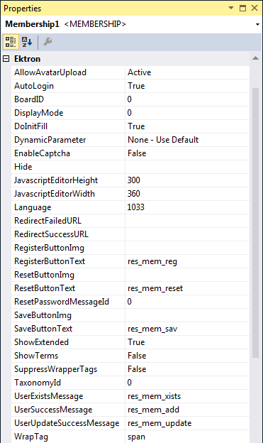 Membership properties
Membership properties
The following are Ektron-specific server controla server control uses API language to interact with the CMS and Framework UI to display the output. A server control can be dragged and dropped onto a Web form and then modified. properties. For information about native .NET properties such as font, height, width and border style, use Visual Studio® help.
- AllowAvatarUpload (String)
When set to Active, Click to upload your avatar appears on the General tab. This allows site visitors to upload an avatar when registering for the site. When set to Disable, the link is hidden. To force site visitors to choose from a gallery of avatars, enter a path to the template containing them.
- BoardID (Long)
The ID of the Discussion Board for which to show the Terms and Conditions. If you don’t know the ID, click Ellipses, then sign in, browse to and select the Discussion Board.
- DisplayMode (Mode)
Lets a developer decide what type of membership form is added to the Web form. The following describes possible settings.
- User Registration. Lets a site visitor register as a membership user. Also allows membership users to update their information and preferences when logged in.
- Reset Password. Lets a membership user reset a password.
NOTE: Starting in Ektron 9.10, password restrictions defined in the Application Setup screen's Regex tab are not applied when memberships users reset their password. See also: Password Regex Tab.
See also: Ektron Knowledge Base article "Changing the Membership User Password Reset Message".
- Unsubscribe Secured. Lets membership user unsubscribe by entering a username and password.
- Unsubscribe Unsecured. Lets membership user unsubscribe by entering a username.
- Account Activate. Let a site visitor activate a membership by entering the ID number sent in the account verification email.
- DoInitFill (Boolean)
By default, Fill occurs during the Page_Init event. Set to false if you want to postpone the fill-action until later. In this case, Fill is automatically called during the Page Render event. You might do this if you need to set or change a property on the control in code-behind and have it render with your changes shown.
- DynamicParameter
To make this control dynamic, select id. When you do, this server control is attached to the user passed as a URL parameter.
- EnableCaptcha (Boolean)
Use to add a Captcha control for more security. It looks like this.
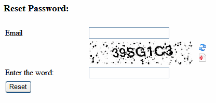
- True. Show Captcha
- False. Hide Captcha
If this property is set to true, Captcha appears while the control is in User Registration, Account Activate, or Reset Password mode. See www.captcha.net for more information about Captcha.
- True. Show Captcha
- Hide (Boolean)
Hides or displays the output of the control in design time and run time.
- True. Hide the control output.
- False. Display the control output.
- JavascriptEditorHeight (Integer)
Set the height in pixels for the eWebEdit400 editor. The default is 300.
- JavascriptEditorWidth (Integer)
Set the width in pixels for the eWebEdit400 editor. The default is 360.
- Language (Integer)
Set a language for the server control. This property shows results in design-time (in Visual Studio) and at run-time (in a browser).
- RedirectFailedURL (String)
The URL to which a membership user is sent if the registration fails.
- If the page resides in the same folder as the registration page, enter the page name. For example, RegFailed.aspx.
- If the page resides in a subfolder, enter its path. For example, members\RegFailed.aspx.
- RedirectSucessURL (String)
The URL to which a membership user is sent when the registration succeeds.
- If the page resides in the same folder as the registration page, enter the page name. For example, RegSucceed.aspx.
- If the page resides in a subfolder, add its path. For example, members\RegSucceed.aspx.
- RegisterButtonImg (String)
Lets you replace text on the register button with an image. Enter a path to the image. For example:
http://www.example.com/buttons/registerbutton.gifIf the image is located in the site root, enter only the subfolder path and image name. For example:
/buttons/registerbutton.gif - RegisterButtonText (String)
Text that appears on the Register button. The default is Register. If you use a register button image, you do not see this text.
- ResetButtonImg (String)
Lets you replace text on the reset button with an image. Enter a path to the image. For example:
http://www.example.com/buttons/resetbutton.gifIf the image is located in the site root, enter only the subfolder path and image name. For example:
/buttons/resetbutton.gif - ResetButtonText (String)
Text that appears on the reset button. The default is Reset. If you use a reset button image, you do not see this text.
- SaveButtonImg (String)
Lets you replace text on the Save button with an image. Enter a path to the image. For example:
http://www.example.com/buttons/savebutton.gifIf the image is located in the site root, enter only the subfolder path and image name. For example:
/buttons/savebutton.gif - SaveButtonText (String)
Text that appears on the save button. The default is Save. If you use a save button image, you do not see this text.
- ShowExtended (String)
Decide if the Custom User Properties Tab is available when using this control. The default setting is True.
- True. Show Custom User Properties tab.
- False. Hide Custom User Properties tab. For more information, see Creating Custom User properties.
- True. Show Custom User Properties tab.
- ShowTerms (Boolean)
Terms and Conditions are defined for the Discussion Forum specified in the Membership server control's
BoardIDproperty. If you set theShowTermsproperty toTrue, the Terms and Conditions for the forum identified in the control'sBoardIDproperty appear near the bottom of the Membership server control. A membership user must check the box to complete a registration.If Terms and Conditions are defined for the specified Discussion Board and
ShowTermsproperty is set toFalse, you must accept the Terms and Conditions the first time you create a post or a reply. - SuppressWrapperTags (Boolean)
Suppresses the output of the span/div tags around the control.
- True. Suppress wrap tags.
- False (default). Allow wrap tags.
- TaxonomyID (Long)
The ID of a taxonomya content-level categorization system that uses one-to-many relationships (such as Ronald Reagan is to Actor, Governor, and President) to create a scalable organization of content. A taxonomy lets your site visitors navigate content independent of the folder structure. available to users. A user editing or creating a profile can select which categories from this taxonomy to associate with their profiles.
- UserExistsMessage (String)
The message that appears when a membership user already exists. The default message is: Username(email) already exists!
- UserSuccessMessage (String)
The message that appears when a membership user successfully registers. The default message is: You have registered successfully. You can also use this property to set the message that appears when users successfully unsubscribe or reset their password. To do this, enter the success message in this property and set the
DisplayModeproperty to the proper usage. - UserUpdateSuccessMessage (String)
The message that appears when a membership user successfully updates their information. The default message is: You have successfully updated your information.
- WrapTag (String)
Lets a developer specify a server control’s tag.
- Span (default). Designate an inline portion of an HTML document as a span element.
- Div. Apply attributes to a block of code.
- Custom. Lets you use a custom tag.
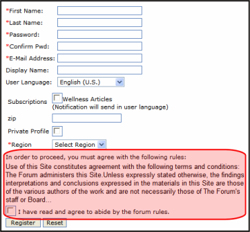 General tab
Fields with a red asterisk (*) are required fields.
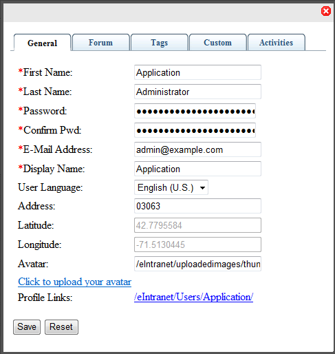
- First name. Enter your first name.
- Last Name. Enter your last name.
- Password. Enter a password.
- Confirm Password. Re-enter the password.
- E-Mail Address. Enter your email address. Notification email is sent to this address unless the Disable E-mail Notification field is checked. Also, this address identifies the user sending Instant email.
- Display Name. Enter the name you want to display to others, which can be a nickname or title.
- User Language. Select from available languages.
- Address. Enter the address (or just the zip code) of where you are located.
- Latitude. This field is automatically determined by the address.
- Longitude. This field is automatically determined by the address.
- Avatar. Click Click to upload your Avatar and choose an image file that you want to associate with your profile. By default, the maximum file size of an avatar is 200 kilobytes. Also, the avatar's height and width cannot exceed 125 pixels preserving the aspect ratio.
Forum tab
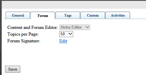
- Content and Forum Editor. If the Ektron administrator has chosen an editor, it appears but cannot be changed. Otherwise, possible editors appear in a drop-down, and you can choose one. See also: Changing the Default Editor.
- Topics per Page. Select a number of topics to display on a page. If the number of topics exceeds the number you select, a scroll bar lets you see the additional topics. For example, if you select 10, and there are 25 topics, only 10 are displayed at one time, but you can scroll down to see all topics.
- Forum Signature. Click Edit to enter or modify a signature that appears below each post you make to a forum topic.
Tag tab
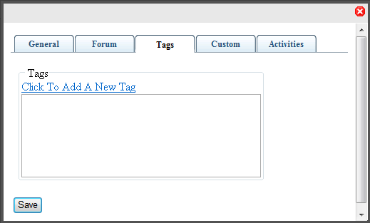
- Tags. Keywords that you can assign to content and library items, which allows for tag-based searching. For example, you can add the tag EAC (Employee Activity Committee), and tag users related to the EAC. In this way, you can search for the users to which the EAC tag is applied. A tag cannot exceed 25 characters, and can include only alphabetical or numeric characters, a hyphen, or an underscore.
Custom tab
Fields with a red asterisk (*) are required fields.
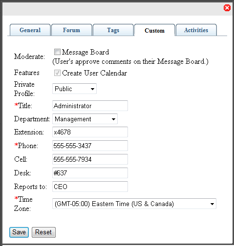
- Moderate. Check this box to give this user privileges on a message board to approve and delete posts. Regular users in a group message board can create and delete only their own posts.
- Features. Check this box to give the user an individual calendar. (There may be other features to grant also.)
- Private Profile. Choose an option:
- Public. User information is accessible by others.
- Private. User information is not accessible by others.
- Colleagues. User information is accessible only by colleagues of the user.
- Title. Enter the title of the user.
- Department. Select the department to which this user belongs. The list contains any departments that you have created.
- Extension. Enter the user's telephone extension.
- Phone. Enter the user's company telephone number.
- Cell. Enter the user's cell phone number.
- Desk. Enter the value that identifies the location of the desk (or cubicle, or office), if your office identifies such things. This can be valuable in locating an employee on an office map.
- Reports to. Enter the person to whom the user reports. This can be valuable for developing organizational charts.
- Time Zone. Select the time zone where the user works.
Activities tab
By default, all activity is checked for the Activity Stream widget.
Check boxes to select criteria for activity types you want to see from colleagues or community groups. You can also select activity that you want colleagues to see, under the My Activities subtab. See also: Sending Notifications to a Community.
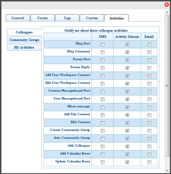
- SMS. A checked box indicates that the activity type will be sent to your cell phone Short Message Service (SMS).
- Activity Stream. A checked box indicates the activity type that will appear in the Activity Stream widget.
- Email. A checked box indicates the activity type that will be sent to your Email address, which is specified in your profile's General tab.
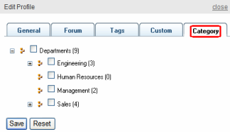
Category tab
The Category tab lets you select from a list of taxonomy categories with which you want to be associated. You determine which taxonomy appears on the tab by setting the TaxonomyID property.
IMPORTANT: The Category tab appears only when an ID is assigned to the TaxonomyID property.