). When pinned, the icon changes (
 ).
).IMPORTANT: If you are using Internet Explorer 11, set the following parameters to ensure optimum functionality.
1. Press Alt/X to display the Internet Explorer Tools menu.
2. Choose Compatibility View Settings.
3. Uncheck Display intranet sites in Compatibility View.
If you are using Internet Explorer 10, set the following parameters to ensure optimum functionality.
1. Press F12. A settings menu bar appears at the bottom of the browser above the tabs.
2. Set Browser Mode to IE10 (not Compatibility view).
3. Set Document Mode to Standards.
4. Click X to exit.
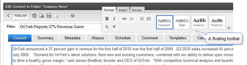
In several places within the Ektron Workarea, a rich-text editor appears. For example, when creating or editing HTML content, the editor lets you apply text styling, insert images and tables, and edit the content source. To access these functions, use the editor toolbar.
In some editor locations, the toolbar "floats," and you can drag it to any screen location. In other locations, the toolbar is fixed at the top of the editor. To change a fixed toolbar so that it can float, see Detaching the editor's fixed toolbar
NOTE:
). When pinned, the icon changes ().
The editor toolbar consists of tabs with buttons. A system administrator can customize the toolbar options depending on the context. For example, he may want the Inspector available when editing content in the Workarea but not while editing "in context." For information about customizations, see Customizing the editor and Modifying editor plug-ins.
 Editor toolbar options
This section describes each button on the editor toolbar, which is organized into 3 tabs. For documentation of additional buttons and tabs available when editing content, see Creating new content.
NOTE: Customizing the editor's toolbar buttons explains how an Ektron administrator may change the toolbar options.
Format tab
 —Bold (Ctrl/b). Make selected text bold.
 —Italic (Ctrl/i). Make selected text italic.
 —Superscript. Make selected text appear smaller and above text line.
 —Subscript. Make selected text appear smaller and below text line.
 —Add Hyperlink. Add information about a hyperlink. See Working with links.
 —Display bubble text on content. See Displaying bubble text on content.
 —Number. Begin the line on which the cursor rests with a number. If the line above this line is:
 NOTE: The Number button applies a number to each paragraph. To switch to regular paragraphs, click the button a second time.
 —Bullet. Begin the line on which the cursor rests (or all selected lines) with a bullet.
NOTE: The Bullet button applies a bullet to each paragraph. To switch to regular paragraphs, click the button a second time.
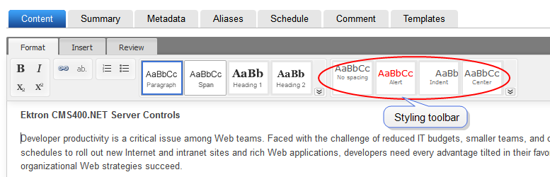
 —Formatting toolbar. Lets you format selected text.
 —Styling toolbar. Lets you apply styling to selected text. See also: Applying stylesInsert tab
 . Insert library file. See Working with files in the library.
 . Insert template. See Using a template to structure content.
 . Insert external content (such as a video). See Editing in EktronEmbedding external content
 . Insert a table. See Working with tables.
 . Insert symbols and special characters.. Add a hyperlink. See Working with links.
 . Add a bookmark. See Adding a bookmark.. Display bubble text on content. See Displaying bubble text on content.
 . Insert horizontal line.
Review tab
. Insert horizontal line.
Review tab
 . Validate content against selected guidelines. See Validating content.
 . Translate content. See Translating content.
 . View content source. See Viewing and editing HTML source content.Editor notes
StyleConfig.js. For example, headings, bullets, and bold fonts may be maintained during a paste operation, but the actual font may not. See also:Creating styles and classes.IMPORTANT: When you paste content from another application, the editor formats that content into valid, minimal HTML and retains as much formatting and styling as possible. However, results are browser-dependent.
NOTE: If you apply the Span style, you can select it in the Inspector to enter style modifications.
Applying styles
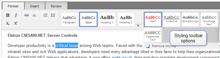
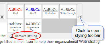
To apply inline styles or style classes to text, use the styling toolbar.
You can select paragraphs or words, then use styling toolbar buttons to style the selected text. Click the down arrow in the toolbar's lower right to view additional buttons. Styling buttons are context-sensitive, so they vary according to cursor location, which format toolbar button is selected, and whether any text is selected.
Place the cursor anywhere inside a paragraph to select it.
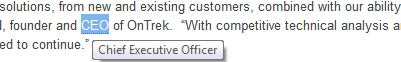
For example, within the editor, select the text critical issue and click Span ( ). Next, open the styling toolbar, and click one or more buttons to apply styling.
To modify the style buttons, an Ektron administrator modifies the styleconfig.js file, as described in Creating styles and classes.
Best Practice
To enhance your site's appearance, define a set of styles from which content authors can select, instead of letting authors apply styling as needed.
Removing styling from text
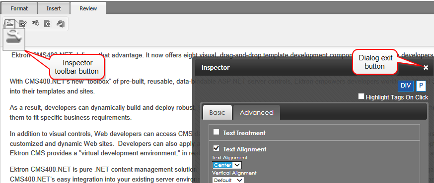
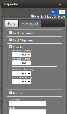
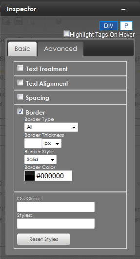
Applying refinements with the Inspector
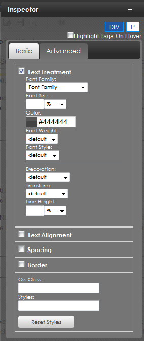
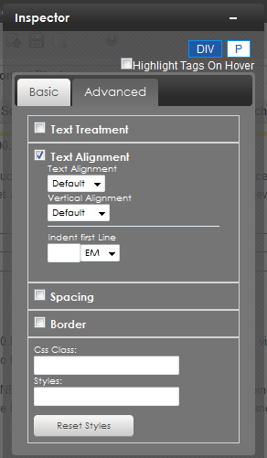
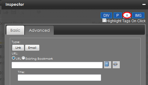
Use the Inspector to perform advanced actions on content items (images, hyperlink, paragraphs, and so on). If enabled, the Inspector
NOTE: If you apply the Span style, you can select the affected content in the Inspector to enter style modifications.
The Inspector lets you apply additional properties to the selected element.
Working with links
This section explains how to view, insert, or delete links to an external Web site or email address. To learn how to link to another Ektron content item, see Working with quicklinks. To learn how to link to paragraph within an Ektron content item, see Adding a bookmark.
Viewing a link
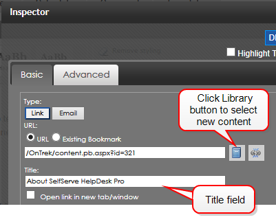
Inserting a link to text
) on the Format tab. (If you click Link on an empty space, a link appears in the content as New Link. Be sure to change New Link to something meaningful.)—Image—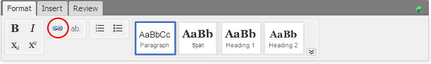
A link tab appears.

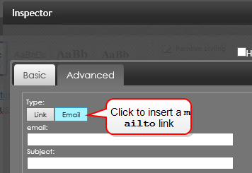
Alternatively, you can insert a mailto link. If you do, place the email address in the email field, and optionally a default Subject.
You can set or modify these link properties within the Inspector.
Inserting a link to an image
To learn about inserting an image, see Inserting an image.
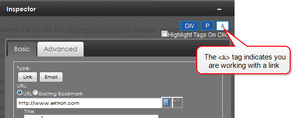
NOTE: You know that you selected an image if the Inspector displays an <IMG> tag.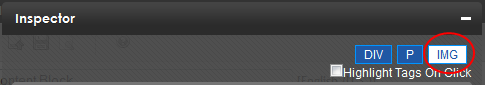
Working with quicklinks
A quicklink is a special hyperlink that "jumps" to content on your website. You can apply a quicklink to text or an image. When a site visitor views the content and clicks the quicklink, a new page appears, displaying the referenced content.
Adding a quicklink to content
).NOTE: If you do not select text or an image before inserting a quicklink, the referenced content's title becomes the quicklink text.
Editing a quicklink
Deleting a quicklink
 ). The link is removed.Adding a bookmark
Use a bookmark to let a site visitor “jump” from any word or phrase to another place in the same content block. On your Web page, text appears in a different color to indicate the bookmark.
Bookmarks are particularly helpful on a long page. For example, your Web page contains minutes from several meetings, and the top of the page lists meeting dates. You could assign a hyperlink to each date, and a bookmark to each set of minutes. A site visitor can click any date to “jump” (using the bookmark) to those minutes.
To use a bookmark, you create 2 things:
For example, place the text [ Top ] [ Bottom ] at the top and bottom of a content block. The following procedure shows how to create bookmarks so that clicking [ Top ] at the bottom of the page jumps to the top of the page, and clicking on [ Bottom ] at the top of the page jumps to the bottom of the page.
). A bookmark icon displays next to the source text but does not show up on the Web page.PageTop.PageBottom.). The text is selected.Working with tables
Inserting a table
 ). A table dialog box appears.
NOTE: You can use Tab to move from one cell to the next. If you are on the last cell, Tab creates a new row. Use Shift/Tab to move backwards.
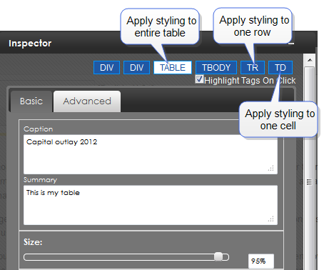
Applying properties to a table
Use the InspectorTR), or a single cell (TD).
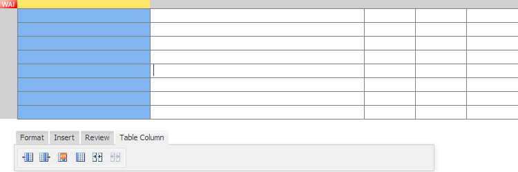
Modifying rows and columns
Click the gray area beside a table row or above a table column. Your selection is highlighted.
You can use the following functions on selected rows or columns:
 . Add column to the left
 . Add column to the right
 . Add row below
 . Add row above
 . Delete column
 . Delete row
 . Format column as header (create a 508Section 508 Of The Rehabilitation Act - requiring electronic and information technology to be accessible to people with disabilities.-compliant table without modifying the source)
 . Format row as header (create a 508-compliant table without modifying the source)
 . Merge cells (to select several cells, depress Shift while selecting)
 . Split cells (depress Shift while selecting the cell to be unmerged)
IMPORTANT: When you save and publish your content, your site styling is applied. Therefore, a table in the Workarea may appear differently from a table you edit in context.
—Table with merged cells—
NOTE: To split a merged cell, select the column or row of the merged cell before clicking Split.
Modifying a table style
With the Inspector open, click anywhere in a table to view styles and advanced properties you can apply.
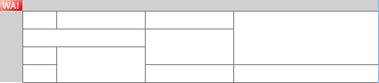
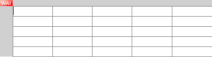
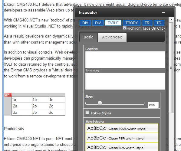
In the following example, a 3x3 table was created. Clicking in a cell, the nested tag structure shows the following:

Click any tag to see styles you can apply to it. For example, click  to see table properties. The following image shows the table size reduced to 25%.
Moving a table
When you make a table the content focus (a colored bar appears around the table), a tab appears above the table's left top corner. Use the tab to drag the table to another place in your content.
NOTE: You can also move a table in Source Viewer.
Deleting a table
Working with images
The easiest way to insert an image into content is by dragging and dropping it from a Windows Explorer window. You can also
Inserting an image
Inserting an image using drag and drop
You can drag-and-drop an image from your computer into Ektron content using Windows File Explorer. You can drag and drop only one image at a time.
Dropped images are added to the libraryA folder that stores images, files, quicklinks, and hyperlinks that can be inserted into HTML content for future reuse. Dropped images must have one of these extensions: .jpg, .gif, or .png, and cannot exceed 5 MB.
When dragging and dropping, the file name becomes the item's title, and no other library information is collected (for example, its summary and metadata). Once the content is saved, use the Edit Library screen to add information for the new library item.
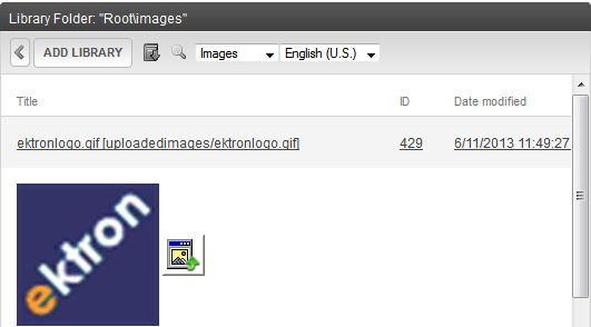
Inserting an image using the Library
). The Library screen appears. ) to find an image by title, description, or internal file name.
NOTE: If the file is not in the library, you can insert it by clicking the Add Library button > Browse and navigating to the file. Then, enter a title and optionally a description and metadata information. The file is inserted into the content and added to the library.
 ). The image is inserted into the content. (You can also double-click the image.)
Alternatively, you can insert a miniature version of the image, called a thumbnail, by clicking the thumbnail button ( ). When the thumbnail appears on a Web page, a site visitor clicks it to view a full-sized image.
Editing images
To adjust an image's properties, click to select it then open the Inspector
NOTE: You will know that you selected an image if the Inspector displays an <IMG> tag.
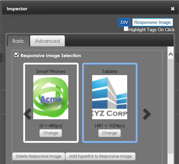
The Inspector’s Advanced tab lets you modify the image size, position, wrapping, and so on, and lets you select images that change based on breakpoints for viewing modes of your users. See Adding a group by breakpoint.
For example, click Responsive Image Selection > Change and select an image to display when screen resolution is 480 pixels or fewer.
If you reduce the size of the editing window to under 481 pixels, the editor automatically switches to the smaller picture.
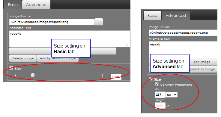
Adjusting image size
Within the Inspector, the Basic and Advanced tabs have a field for adjusting image size.
<img> tag as a style attribute. <img> tag as is.You can embed the following types of external content into the editor.
You can also insert content using its <embed> or <object> code.
Embedded elements are treated responsively. This means that a video or map is sized according to the device on which it is viewed.
Prerequisite
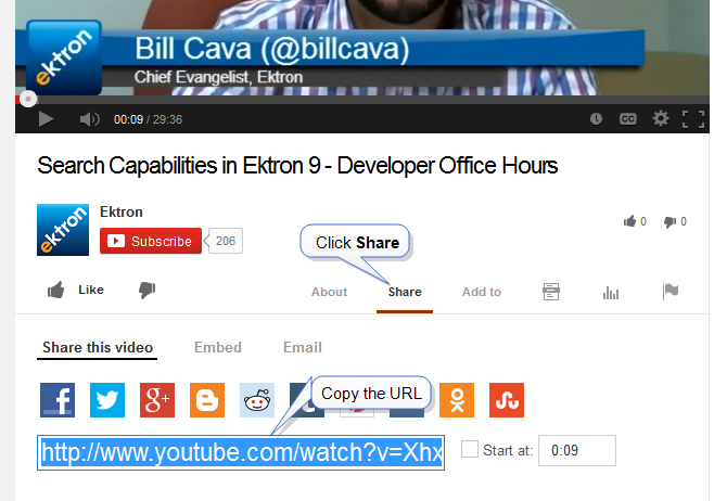
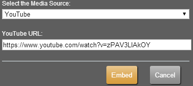
You need the URL of the media item that you want to embed. Content providers typically supply an easy way to find the content's URL. For example, to find a YouTube video, click Share, then copy the URL.
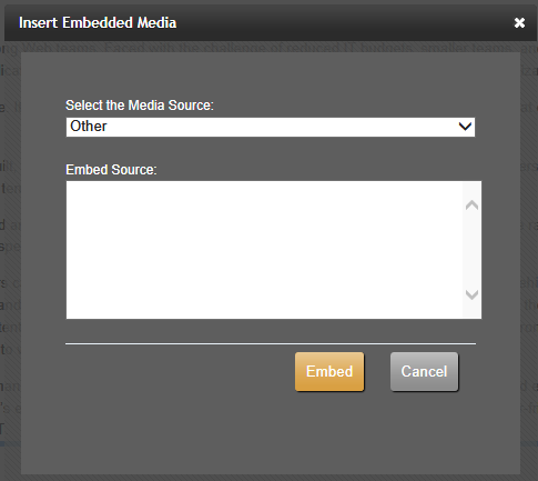
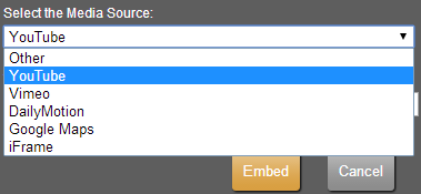
). The Insert Embedded Media screen appears. To embed content from another source, choose Other in the Select the Media Source pulldown, then insert the code. See also: Tips for embedding a Google map.
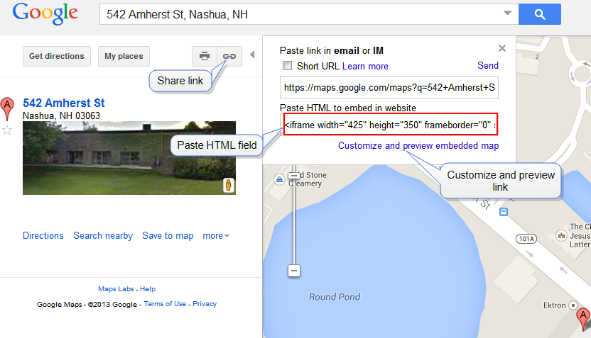
Tips for embedding a Google map
Click the Share link. Then copy the text in the Paste HTML to embed in website field and paste it into the Embed Source field.
To modify the map before inserting it, click the Customize and preview embedded map link. You can change the size, view, and zoom. When finished, copy the HTML from the bottom of the screen and paste it to the Embed Source field.
Removing external content
). Source Viewer appears.<div class="embed-container> tags that surround the video, as shown in the following example.<div class="embed-container"><iframe marginheight="0" marginwidth="0" src="https://maps.google.com/maps?f=q&source=s_q& hl=en&geocode=&q=542+Amherst+Street,+Nashua,+NH&aq=0&oq=542&sll=42.752811, -71.49671&sspn=0.203443,0.308647&ie=UTF8&hq=&hnear=542+Amherst+St,+Nashua,+New+Hampshire+03063 &t=h&ll=42.796156,-71.573181&spn=0.120922,0.219727&z=12&iwloc=A&output=embed"
frameborder="0"  height="480"  scrolling="no"
 width="640"></iframe>
<br/><small><a href="https://maps.google.com/maps?f=q& source=embed&hl=en&geocode=&q=542+Amherst+Street, +Nashua,+NH&aq=0&oq=542&sll=42.752811,-71.49671&sspn=0.203443,0.308647& ie=UTF8&hq=&hnear=542+Amherst+St,+Nashua,+New+Hampshire+03063&t=h& ll=42.796156,-71.573181&spn=0.120922,0.219727&z=12&iwloc=A" style="color:#0000FF;text-align:left">View Larger Map</a></small>
</div>Displaying bubble text on content
Viewing and editing HTML source content
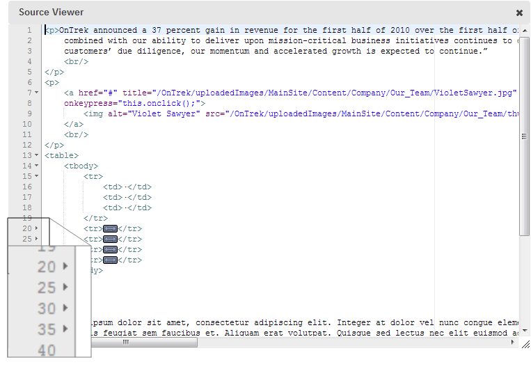
To view and edit the HTML source, click View Source () on the Review tab. The Source Viewer appears. As you edit the HTML, the content window dynamically updates with your changes.
When you finish editing in the Source Viewer, click the X in the top right corner.
The Source Viewer supports tag completion. For example, if you type <p>, the Source Viewer automatically adds a closing </p> tag.
The Source Viewer supports collapsing and expanding tags. For example, if a table is in the content, a small arrow appears next to the line numbers. Click the arrow to expand or collapse the nested tags.
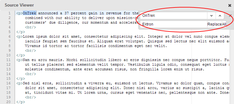
Finding and replacing text in the source viewer
NOTE: Replacing text is supported only in the Source Viewer. Search is supported in the editor by pressing Ctrl/f.
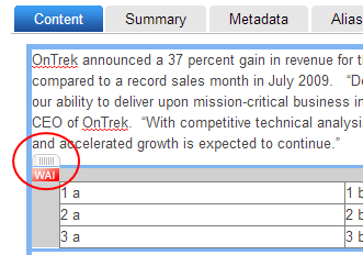
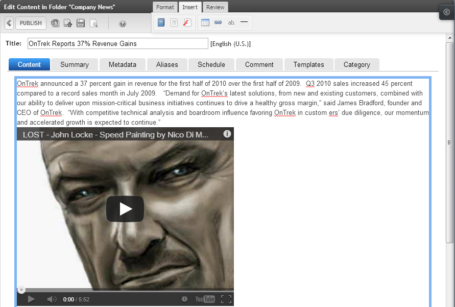
Consider replacing OnTrek with Ektron in the following content.
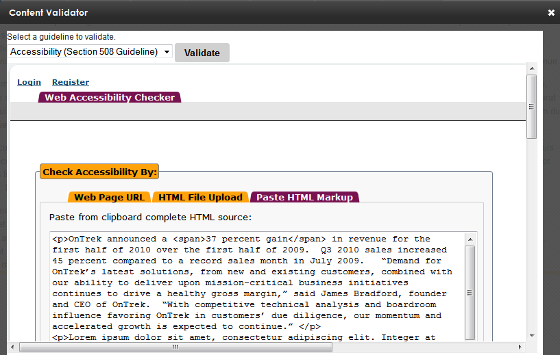
<p>OnTrek announced a 37 percent gain in revenue for the first half of 2010
over the first half of 2009.  Q3 2010 sales increased 45 percent compared to
a record sales month in July 2009. “Demand for OnTrek’s latest solutions,
from new and existing customers, combined with our ability to deliver upon
mission-critical business initiatives continues to drive a healthy gross margin,”
said James Bradford, founder and CEO of OnTrek. “With competitive technical
analysis and boardroom influence favoring OnTrek in customers’ due diligence,
our momentum and accelerated growth is expected to continue.”
<br/></p>
). Source Viewer appears.Validating content
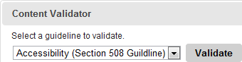
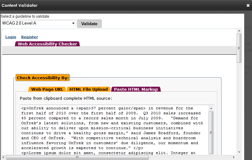
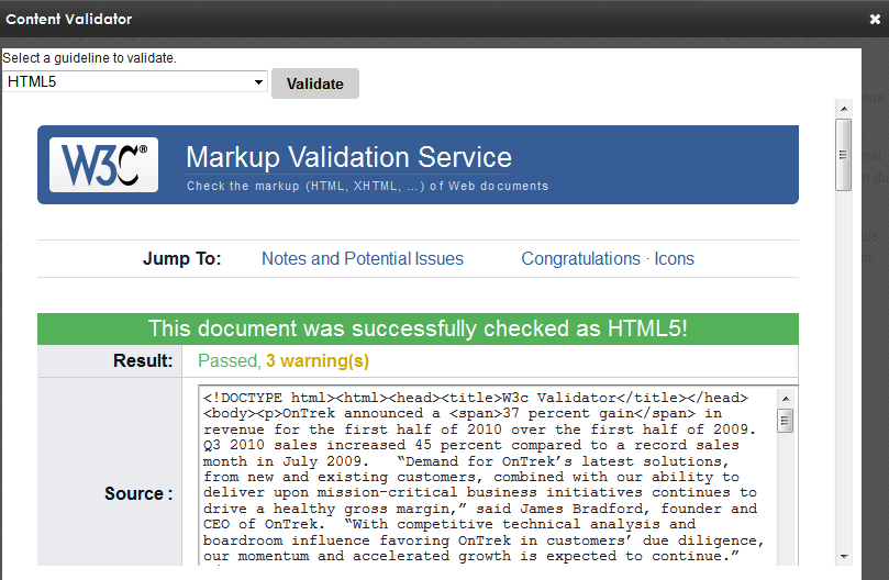
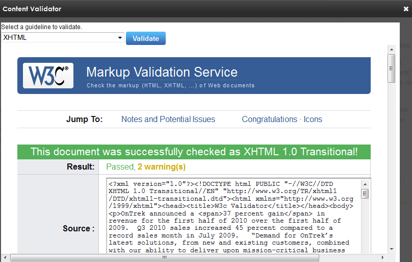
You can validate content against Accessibility (Section 508Section 508 Of The Rehabilitation Act - requiring electronic and information technology to be accessible to people with disabilities. Guideline), WCAGWeb Content Accessibility Guidelines - making Web content accessible to people with disabilities., HTML5, or XHTML guidelines by clicking Validate () on the Review tab. The Content Validator screen appears. Choose which guideline you want to use from the drop-down menu, then click Validate. Options include:
NOTE: Each standard may have conflicts with the other standards; valid HTML5 code may not be valid XHTML code. Choose the standard guideline that you need.
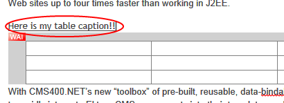
Using a template to structure content
A template is section of HTML-formatted content that users can copy into their content for any number of reasons. For example, a template can help maintain a structure, such as image captions. If you want the caption on the left with content flowing around it, create mark-up to do this and put it in a template.
Administrators create content templates within a designated folder structure. When authors are editing content in any folder, they click a toolbar button, then select and insert a template.
The following sections provide additional details on how to create and insert templates.
Creating a template
Prerequisite
You have permission edit files in the Ektron site root folder.
To prepare for templates, create an Ektron folder structure to contain them. Then, specify its parent folder's ID number at the templatePlugin element in the AlohaEktron.aspx file, located in siteroot\Workarea\FrameworkUI\js\Ektron\Controls\EktronUI\Editor\Aloha\.
templatePlugin: {FolderID: 45}
IMPORTANT: You cannot use zero (0), the root folder, as the parent folder for templates.
NOTE: You set permissions on the parent template folder as you do for any other folder. Users must have read-only or greater permission for the parent template folder in order to insert a template into content.
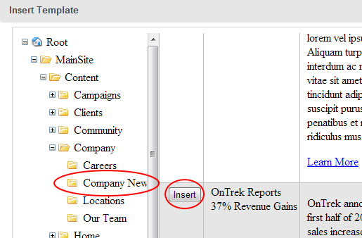
After you create the folder, open it (or any of its child folders) and create and publish HTML content to be used as a template. Authors may only select published content from this folder structure when inserting a template into content.
Inserting a template
To insert a template
) . The template is copied to your content, and then decoupled from the template source file. So, you can modify the copied text as you like; modifications do not affect the template. Also, if you later change the template, that action does not affect previously-inserted copies.
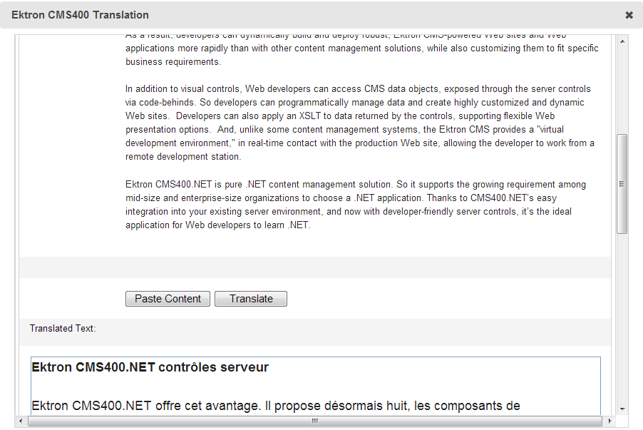
Translating content
This section describes machine translation, which converts content to another language. Machine translation operates on an entire piece of content, not selected portions of content.
IMPORTANT: Before you can use machine translation, a system administrator must enable it. See Enabling machine translation.
) on the Review tab. The content appears in a new window.Customizing the editor
An administrator can customize the editor.
Detaching the editor's fixed toolbar
By default, the toolbar is in a fixed position in the following editors:
An Ektron administrator can change this, so that the toolbar "floats" in these locations. To do this, open the \siteroot\ektron.cms.framework.ui.config file, and find the <add name="EditInContext"> element. Within that, find the <add name="Content" property and delete ektron/persistToolbar.
Changing the default editor
The editor is determined by the ek_EditControlWin (Windows) or ek_EditControlMac (MacIntosh) element values in web.config. You can change the default values to use another editor, or let the user choose the editor.
<!-- EditControlWin may be either "Aloha" or "ContentDesigner" or "UserPreferred" -->
<add key="ek_EditControlWin" value="Aloha" />
Aloha designates the default editor for all users. See also: Editing in Ektron.ContentDesigner designates the eWebEdit400 editor for all users. See also: Using the eWebEdit400 editor.UserPreferred lets users choose an editor on their profile page. See also: Creating a user. If UserPreferred is chosen for Windows or Macintosh users, Aloha is the default value for those users.
Modifying editor plug-ins
Plug-ins are open-source, customizable pieces of JavaScript code that provide editor functionality. Ektron provides several useful plug-ins that lets you customize the editor. You specify the editor plug-ins that you want to use in the siteroot\ektron.cms.framework.ui.config file. Many plug-ins are buttons on the editor toolbar. See also: Customizing the editor's toolbar buttons
Editor plug-ins are stored at \Workarea\FrameworkUI\js\Ektron\Controls\EktronUI\Editor\Aloha\plugins\ektron\[plug-in_name]. Each [plugin_name] folder has supporting CSS and lib folders containing these files:
Plug-in_Name.css. Cascading style sheet for the plug-inPlug-in_Name-plug-in.js. JavaScript file for the plug-inPlug-in code has the following basic outline:
Init function executes upon loading (usually to create the button)createButtons function adds a button to floating menuEach editor plug-in has one of these prefixes:
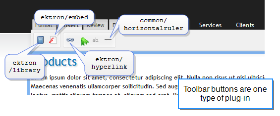
common/. Native to the editorektron/. Supplied by Ektronextra/. Supplied by others. You can create your own plug-ins. (This document does not describe how.)Editor plug-ins
The following are standard editor plug-ins.
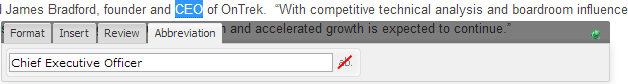
common/ui, common/block. Required internal plug-ins; do not removecommon/abbr (). Specify an abbreviation for content, which shows up as bubble text. See also: Displaying bubble text on content.common/characterpicker ( ). Insert special characters (such as ® and ±)
common/contenthandler. Controls sanitization of content and supports cleaning of Microsoft Word documents being pasted to the editor to preserve as much formatting as possible.Content handler is independent of paste. It cleans content when certain actions are performed, such as paste, getContents (getting content to save it to the database), and initEditable (opening content).
NOTE: If content contains improper tagging, it is removed when pasted. Also, images embedded within documents are not pasted into Ektron content; you must insert them separately.
dom-to-xhtml/dom-to-xhtml. Ensures XHTML compliance. This plug-in enables Ektron controls.common/highlighteditables. Not a toolbar button; if enabled, you can click a content item to highlight it for easy identification of content elementscommon/horizontalruler (). Insert horizontal linecommon/list ( and
and  ). Create an unordered (bulleted
 <ul>) or ordered (numbered <ol>) listcommon/paste. Not a toolbar button; uses the browser’s ability to paste content from the clipboardcommon/table ( ). Insert a table See also: Inserting a table.
common/undo. Not a toolbar button; enables the browser’s ability to undo the last actionektron/bookmark (). Set a bookmark See also: Removing a link.ektron/draganddrop. Not a toolbar button; enables drag and drop of images into content; supported browsers: Webkit-based (such as Safari and Chrome) ektron/editInContextCallback. Raise callback events (that depend on your permissions and workflow) when you “edit in context” Editing content in context on a Web page.ektron/embed (). Embed a video into your content ektron/format. Contains bold ( ), italic (
 ), subscript (
 ), superscript (
 ), and the formatting palette (Paragraph, Span, Heading1-Heading6, Pre)
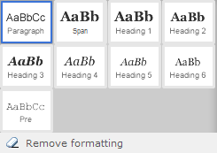
ektron/hyperlink (). Insert a hyperlink See also: Working with links.ektron/library ( ). Insert a library item (file, form, hyperlink, image, and quicklinkA special kind of hyperlink that jumps to another content item on your Web site. (A regular hyperlink jumps to a Web page on the internet.)) into the content
ektron/persistToolbar. fixes the toolbar to the top of the editor screen. See also: Detaching the editor's fixed toolbarektron/sourceview (). Opens a view of HTML coding of the content. Whether you edit in the source viewer or the HTML editor, both views are kept concurrent. See also: Viewing and editing HTML source content.ektron/template(). Insert predefined content into the editor at the cursor location; for example, a caption below an image. See also: Using a template to structure content.ektron/translate (). Machine translate text to another Ektron-supported language. See also: Translating content.ektron/validator (). Verify content against HTML5, XHTML, WC3, and WCAG compliance. See also: Validating content.Creating "Hello-World-plug-in.js"
The following example shows how to create a "Hello World" plug-in snippet within a <span> tag. To learn about creating plug-ins, see http://aloha-editor.org/guides/writing_plug-ins.html.
// define the HelloWorld module using RequireJS
define([
  'aloha',
  'aloha/plug-in',
  'aloha/floatingmenu',
  'aloha/jquery',
  'i18n!aloha/nls/i18n',
  'css!helloworld/css/helloworld.css'],
// callback executed once dependencies are loaded by RequireJS
  function (Aloha, Plugin, FloatingMenu, jQuery, i18nCore) {
  // create and register the Plugin
    return Plugin.create("helloworld", {
      defaults: {
        text: "Hello World!",
        wrapper: '<span class="helloworld"></span>'
      },

      init: function () {
        // executed on plug-in initialization
        window.console.info("HelloWorld: Begin initialization");
        this.createButtons();
        window.console.info("HelloWorld: End initialization");
      },

      createButtons: function () {
        // provide locally scoped version of this for use
        // in callbacks,e tc.
        var that = this,
          tabInsert = i18nCore.t('floatingmenu.tab.insert');

        // create hellowworld button
          this.helloWorldButton = new Aloha.ui.Button({
          'name': 'helloWorld',
          'iconClass': 'ektron-aloha-button ektron-aloha-helloWorld',
          'size': 'small',
          'onclick': function () {
          that.insertHello();
        },
        'tooltip': "Click to insert Hello World!",
        'toggle': false
        });

        // add it to the floating menu
        FloatingMenu.addButton(
          'Aloha.continuoustext',
          this.helloWorldButton,
          tabInsert,
          1
        );
      },

      insertHello: function () {
        window.console.info("HelloWorld: Hello World Button clicked");
        var html = jQuery(this.settings.wrapper).text(this.settings.text);
        // get the current selection range
        var range = Aloha.Selection.getRangeObject();
        if (range.isCollapsed()) {
          GENTICS.Utils.Dom.insertIntoDOM(html, range,
            jQuery(Aloha.activeEditable.obj));
        }
        else {
          // remove the contents of the current selection
          range.deleteContents();
          // insert our Hello World elements
          GENTICS.Utils.Dom.insertIntoDOM(html, range,
          jQuery(Aloha.activeEditable.obj));
          // deselect the current range object
          Aloha.getSelection().removeAllRanges();
        }
        return false;
      }
    });
  }
);
Customizing the editor's toolbar buttons
The editor toolbar appears in several Workarea locations, and on your site when logged-in users edit in context. A variation of the toolbar appears when content authors create HTML content, enter a calendar event, reply to a discussion forum post, and so on.
In the \siteroot\ektron.cms.framework.ui.config file, the <add name="EditInContext"> element lists all editor toolbar variations. Following each variation is a list of buttons for that variation. To customize the functions that appear in a variation, edit the list.
IMPORTANT: When placing the editor on an .aspx page, specify its toolbar using the ToolbarConfig property.<ektron:AlohaEditor ID="AlohaMessage" runat="server" AllowScripts="false" ToolbarConfig="Mediamedia" />
NOTE: Embedded within each plug-in's description is the editor tab under which it appears. You cannot change this information.
Editor variations
For example, to remove the validator button () from the toolbar when editing a Smart Form rich area text field:
Content element within the ektron.cms.framework.ui.configektron/validator plug-in within the Content element.ektron/validator plug-in (crossed out in the following example).<add name="Content" path="dom-to-xhtml/dom-to-xhtml,common/ui,ektron/format, common/contenthandler,common/table,common/list,ektron/hyperlink, common/highlighteditables,common/undo,common/paste,common/horizontalruler, ektron/translate,ektron/validator,ektron/template,ektron/embed,ektron/inspector, ektron/sourceview,ektron/advancedinspector,ektron/draganddrop,common/block" default="false" />
Creating styles and classes
While the editor supports both inline styles and classes, the preferred method is to use style classes and a css file. This is because inline styles get embedded into the HTML source. If you later need to change the styling, you must modify every affected content item. To change the properties of a style class, on the other hand, simply modify its css file.
NOTE: Inline styles immediately affect the content display. But classes only affect a Web page if it loads the CSSCascading Style Sheet; sets the look and formatting of a markup language document. file that defines them.
Prerequisite
You can edit files on the Ektron server.
Setting up styles and classes
Use the StyleConfig.js file to create styles and classes that appear on
                                    siteroot\Workarea\FrameworkUI\js\Ektron\Controls\EktronUI\Editor\
   Aloha\plugins\ektron\advancedinspector\lib\StyleConfigjs
Creating styles example
In this example, an inline style named “Alert” (which applies to the STRONG tag) is defined as follows:
"STRONG": {
  "styles": {
    "Alert":  {
        "type": "style",
        "value": "color:red;",

               }
             }
           }
STRONG. The tag to which the style may be applied.Alert. The name of the style that appears on type. Identifies this definition as either an inline style or a CSS class.value. Defines the value of the style property, "color:red;", that will be applied to the tag.Example result: <strong style="color:red;">
Creating classes example
In this example, a CSS style class named “text-justify” (which applies to the P tag) is defined as follows:
"P": {
  "styles": {
    "Justify":  {
        "type": "class",
        "value": "text-justify",

                 }
             }
      }
P. The tag to which the style may be applied.
Justify. The name of the style that appears on type. Identifies this as a class rather than an inline style.value. Defines the value of the class property, “text-justify”, that will be applied to the tag (matches the class name defined in the css file).Example result: <p class=”text-justify”>
Integrating the editor into an ASPX page
ektronUI:Editor Control
The ektronUI:Editor control is an ASP.NET server component that you can integrate into an .aspx page.
The ToolbarConfig property value (EditInContext in this example) specifies which plug-ins to load with the editor. See also: Modifying editor plug-ins.
<!DOCTYPE html PUBLIC "~//WJC//DTD XHTML 1.0 Strict//EN" "http:..www.w3.org/TR/xhtml1/DTD/xhtml1-strict.dtd">
<html xmlns="http://www.w3.org/1999/xhtml">
  <head runat="server">
     <title>Editor control integration</title>
  </head>
  <body>
    <div id="content">
      <ektronUI:Editor ID="Editor1" runat="server" ToolbarConfig="EditInContext" />
    </div>
    </body>
</html>
 ).
).