 Categories and products in the mobile app
The Browse Categories option on the shop screen allows users to drill down through the product catalog. After tapping the option, the user is shown all available categories. From there, tapping on each subsequent category displays the respective child categories, if no child categories exist, then the products assigned to that category are displayed.
We refer to these different types of screen with the following names:
Top Categories > Sub-categories > Product List > Product Detail
Top Categories
This screen shows the top-level categories in the product catalog defined for the website.
Category Images
Category images shown on this page are derived from the Small Image. Admin Console > Catalog >Categories > Select the Edit option for the desired category > Content finger tab > Small Image Path.
Sub-Category
The sub-category screen displays other categories assigned to the viewing categories for the user to keep drilling down into the product catalog. On this screen, a image banner can be add with or without text that appears below the header and above the categories. A category without a banner image works fine, but adding a banner image can add additional context and styling.
Category Images
Category images shown on this page are derived from the Small Image. Admin Console > Catalog >Categories > Select the Edit option for the desired category > Content finger tab > Small Image Path.
Category Banner
When choosing the image, it is important to make sure the banner image and text work well together.
Customize how categories are displayed by including a banner image, text, and the text color.
- Go to Admin Console > Mobile App.
- Select the Edit button for the desired website.
- Select the Categories finger tab.
- Select the Edit button for the desired category.
- Populate the following fields:
Field Name Description Category Banner Image
The banner image should be roughly 1080x450. If the image is not rectangular in shape, it will be cropped automatically and the results will likely be undesirable. Additionally, when choosing the image, consider how it will look any text that is overlayed. For more information on how to work with images, read this article: Using the local file system media library Primary Text
Larger text overlaid on the image. Secondary Text
Small text, that shows under the primary text and is overlaid on the image. Text Justification
Choose whether the text is left, center, or right aligned. Text Color
Hex decimal text color. The box to the right will display a preview of the color. - Select Save.
Product List
The product list screen is displayed when viewing the lowest level category in the catalog that contains products. The user can search, filter, and sort the products in the list.
Product images
Within this screen, the product images come from the Small Image Path.
Product Detail
The detail screen allows the user to see all information related to the product such as attributes, documents, specifications, and so on
Product Images
Medium Image Path is used for the images on the top of the page when the user first arrives.
By selecting one of these images the user will go to the Product Image Gallery which then using the Large Image Path values.
Specifications
In certain circumstances you are going to want to control the format and styling of the specification on the mobile app compared to the desktop due to the smaller widths of mobile devices.
To help customers with this we've add the ability to create content that can target the mobile app. Allowing you to use completely different content and styling.
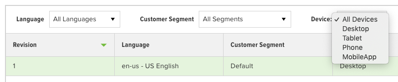
When editing a specification in the Admin Console use the Device drop-down you see above to select the MobileApp option. From here you can create a new revision that will target that device type.
Support for customer segments in the mobile app are not currently supported.
 Need help?