 Understanding blueprint components
Use a Spire Blueprint to customize and extend the front-end of your Optimizely B2B Commerce website. It is part of your eCommerce solution, but separate from the back-end and built on top of the core code to allow easier front-end upgrades and extensions.
The Blueprints is built on top of and extends Spire. B2B Commerce Updates core Spire code automatically when it deploys new versions of B2B Commerce. (In Classic, a theme was self-contained, beginning with copying the Responsive theme, then lived on its own.) The Blueprint is built into a node application that supports server-side rendering.
Optimizely does not support changing a site's Blueprint at run time. You must enter a Support ticket to request to change a site's Blueprint.
Blueprint sandwich
There are several elements that make up the Spire Blueprint. Think of these elements like a sandwich where the main element is the Mobius Theme, which describes how each individual component on your site will be styled. The Mobius Theme is built on the following components:
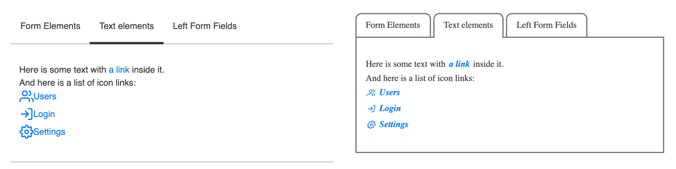
- Post-Styleguide Theme (Bread) - The Post-Styleguide Theme is the place in the theme stack where partners should place only vitally important overrides to the Mobius Theme. Customizations at this layer of the theme are "the final word" on how your site will display, and cannot be overriden by changes made in the CMS Style Guide. The Post- and Pre-Styleguide Themes can include any value that is available in the Base Mobius Theme, which includes applying custom CSS to components, and can be used to make dramatic changes to the way that the UI on your front end appears. For instance, your partner may use the Pre- or Post- styleguide theme to change the look and feel of any Tabs on the site as below:
- CMS Style Guide (Meat) - This includes all the values that can be customized in the CMS Style Guide. This is a limited subset of attributes of the component, and does not include applying custom styling (CSS) or behavior (Javascript) to the components. You can change a lot about your site's look and feel using only the style guide, including all site colors, the size, shape, and color of buttons and form fields, and inserting custom icons where icons may appear, among other things. Changes that are not available in the CMS Style Guide UI must be customized by a developer using the Pre- or Post-Styleguide theme, or in the Blueprint using widget A pre-configured content holder ISC_Content user roles may use to add content to website pages without having to develop page elements. extension points.
- Pre-Styleguide Theme (Bread) - The Pre-Styleguide Theme is the place in the theme stack where partners should place the majority of their customizations to the Mobius Theme. The Pre-Styleguide Theme and Post-Styleguide Theme are technically identical, however changes applied in the Pre-Styleguide Theme may be overriden by changes in the the CMS Style Guide.
- Base Mobius Theme (Plate) - The base Mobius Theme contains all the styles that Mobius components receive out of the box. Before you customize your theme, the styles you see are those that are provided by the Mobius Theme. This includes flat square buttons, a sans-serif font, and a blue and gray based color theme. Anything that is not explicitly provided by another layer of the theme will default to the value provided by the base Mobius Theme.
Example of style precedence
The highlighted cells in the following table show which value would take precedence on a site.
| Primary color | Form Field Shape | Header 1 Font Weight | Check box Icon | |
|---|---|---|---|---|
|
Post Styleguide Theme |
|
|
normal |
|
|
CMS Style Guide |
aqua |
|
800 |
|
|
Pre-Styleguide Theme |
purple |
rounded |
|
|
|
Base Mobius Theme |
blue |
rectangle |
700 |
check |
 Need help?