 Working with the CMS Style Guide in Spire
The CMS Style Guide in the Spire CMS is a tool that lets you make changes to your Optimizely Commerce front-end's colors, typography and components' visual appearance.
Changes made in the CMS Style Guide are immediate and affect every element of the type you are updating. For example, if you make a change to the typography of your level one heading text, that change affects every level one heading on your B2B Commerce front end. For this reason, the Style Guide is a very powerful tool and should be used with caution.
You must add "/contentadmin" to the end of your site URL to access the Spire CMS.

What you can change using the CMS style guide
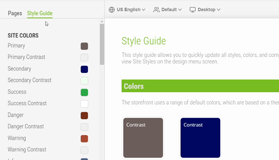
The Style Guide displays the basic configurable styles for the website. The styles are grouped into three main areas - Site Colors, Site Typography, and Components:
- Site Colors are the colors that display on your website. Most colors also have a "contrast" options, which will be used to display text or iconography whenever that color is used as a background.
If accessibility is a priority for your project, make sure to choose colors that provide adequate contrast on your site. To see if your colors meet accessibility standards, this contrast checker is a helpful tool.
- Site Typography applies to the text styles on your website. For each variety of text on the site, you can specify a color, font weight, size and line height. You can also apply text styles like underline, italics and text transformations like all uppercase or lowercase styling.
Text styles applied with the Style Guide can be overridden using the CMS?s Rich Text Editor. For example, if your usual body text is set to black, a user can override this styling to red or blue using the Rich Text Editor. By the same token, styles defined for text in the Style Guide can be selected using the Rich Text Editor, so if a user wants to add level one heading text or include a link, if the user selects the pre-configured styling in the Rich Text Editor, the styles applied in the Style Guide appear.
- The Components group encompasses a wide range of functional elements on your B2B Commerce frontend.
Some options in the Style Guide are grouped to control similar components so they can be styled consistently. For example, field on forms, which can include text entry fields, drop-downs, text areas, and so on should be styled similarly. These options are controlled using the Form Field Options. Field Set options work similarly for groups like radio buttons or checkboxes.
Component examples
To implement UI changes, launch the Spire CMS. From there, access the CMS Style Guide, which lets you update the site's styling without having to code.
For example, if you want to change the color, style and weight of the credit card icon, you make one edit in the CMS Style Guide, then all instances of the icon on the website automatically update. This lets you update static content or "look and feel" site elements without relying on a partner or developer. As a result, you can manage many aspects of your organization's implementation, thereby minimizing maintenance costs.
| Button Widget | Form Field Options | Field Set Options |
|---|---|---|
|
Color: The color of the button |
Border: The outline style of form fields; options are underline, rectangle or rounded. |
Color: The color of field set elements |
|
Shape: The shape of the button. Options are pill, rectangle, rounded. |
Size Variant: The size of form fields. Options are default or small. |
Size Variant: The size options for field set elements. Options are default or small. |
|
Shadow: Determines if the button has a drop shadow. Options are yes and no. |
Error Text: Typography options and styling for error text of form fields |
Group Label Text Properties: Typography options and styling for heading text for field set groups. |
| Active Mode: Appearance when the button is active, that is when it?s been clicked. Options are lighten and darken. |
Label Text: Typography options and styling for label text of form fields |
Item Label Text Properties: Typography options and styling for item text for field set groups. |
|
Hover Mode: The appearance when a user hovers over the button. Options are lighten or darken. |
Hint Text: Typography options and styling for label text of form fields |
|
|
Hover Animation: Behavior when a user hovers over the button. Options are grow, sink and float. |
||
|
Size Variant: One of three preset sizes for the button. Options are small, medium and large. |
||
|
Button Type |
||
| Button Label Typography |
Styling options
| Icon Configuration | Typography | Color |
|---|---|---|
|
In any component that has an icon configuration, you can select a color, source and size for the icon on that component. The source should be a URL to the location of an icon file. The size should be a numeric value, and corresponds to the size of the icon in pixels. |
In general, the typography options are the same as those listed for the general site typography, but they selections will apply to the specific component. This lets you change the color and style of text in more granular areas on the site. |
You can specify a color either using the color picker field, or by inputting a hexcode or RGB values. You can also set colors as a transparency using the Alpha channel slider or by inputting a percentage in the 'A' input box. This creates a lighter and less saturated version of the color selected. |
Update website styles using the CMS style guide
- Go to the Spire CMSby adding "/contentadmin" to the end of your site URL.
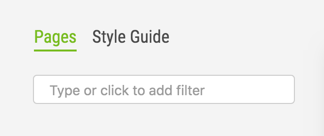
- Select Style Guide from the tab menu.

- In the left menu, select the element whose styles you would like to change. In this example, we will use the body text.
- Update the values you would like to change for the body text. Your changes are automatically saved to draft. To close the editor pane, click outside, or hit Escape on your keyboard.
- If you would like to preview the changes you are making, scroll the staging area on the right until you see the corresponding example of the element you are updating. Changes you make using the Style Guide options will update real-time in the stage.
- To publish changes made in the Style Guide to the live website, click Save at the top of the Style Guide column.
Undoing or redoing changes in the CMS style guide
While updating the CMS Style Guide, you can undo your changes at any time by clicking the Back arrow in the header of the CMS Style Options. You can continue to undo changes back to the first change you made during your current session. You can also use the forward arrow to redo a change that you have previously undone.
When a user clicks Save, it publishes the changes and also resets the undo/redo actions. Once you have saved, you cannot step back through the changes you made.
At any time, you can click Reset Styles to Default, which will return all styles in the tree to the values in the default theme provided by Mobius or a pre-styleguide theme if your partner has included one in your site. You can undo this selection prior to saving if you would like to revert to the customizations you made.
How styles are applied on my website using the CMS style guide
The CMS Style Guide works using the theming principles of the Mobius component library. That means it globally applies changes you make to the related Mobius components. If your B2B Commerce website contains widgets A pre-configured content holder ISC_Content user roles may use to add content to website pages without having to develop page elements. or components that are styled outside of the Mobius theme, either because they are receiving widget-specific styles, or because they were built with components that are not from Mobius, changes made in the Style Guide will not apply to these elements. For example, let's say your partner has implemented a custom promotional banner on your site. If the banner was implemented specifically with a rounded green button, changing the button shape or color in the CMS Style Guide will not impact the button in the promotional banner.
Changes may also not apply if your partner has included a post-styleguide theme in your site, as the post-styleguide theme overrides the values you may input in the CMS Style Guide. Let's say your partner has implemented custom styles that apply to your buttons to animate a subtle hover effect. If you choose a hover effect on your button in the CMS Style Guide, you will not see this change take effect on the site or in the CMS Style Guide stage.