 Attention analysis
Using the attention analysis, you can test the usability of your mailings, templates or drafts before sending them out. A graphical analysis lets you check if crucial elements (logo, call-to-action, promotional offers) are placed to immediately draw a viewer's attention.
To access Attention Analysis, open the Optimizely Campaign menu and select Analytics > Attention Analysis. The overview shows how many analyses you created, and a list of created and requested analyses.
How it works
Attention analysis forecasts the first seconds of viewing a mailing. Like any image, upon first glance, an email scanned by the human eye. During scanning, the focus rests several times on the fixation points. Image information is processed subconsciously at this time.
The Optimizely Campaign attention analysis is not a semantic analysis; that is, it does not analyze the meaning of words, the content of images, and so on. It analyzes visual, physical stimuli and deduces how much attention each item and area of the image receives.
Each analysis consists of more than 50 image properties, such as colors, brightness, contrast, size, position, color saturation, outlines, and textures. This data is processed to forecast the viewing behavior. The forecast model was designed using attention signatures of real, test persons. WhiteMatter Labs develops and verifies this model constantly. The result helps to optimize size, color, and placement of items to make them more eye-catching.
EyeQuant Software by WhiteMatter Labs
Attention analysis is based on the EyeQuant Software developed by WhiteMatter Labs. WhiteMatter Labs is a spin-off founded by Prof. Dr. Peter König, one of the leading European neuroscientists from the University of Osnabrueck. WhiteMatter Labs makes the results of long-term fundamental research usable in marketing.
Until this time, analyzing user behavior meant conducting expensive eye tracking studies with large sample sizes. With EyeQuant, real test persons are no longer necessary. Neuroscientific models allow forecasting of viewing patterns within seconds. The attention analysis is specifically developed to analyze newsletters, websites, and related items. The seamless integration in Optimizely Campaign lets you run Attention Analysis as an part of a continuous optimization process for mailing campaigns:
- Evaluation of different design drafts at the first stage
- Pre-test of templates, landing pages and micro sites
- Testing of special design elements in the course of perception
Validity
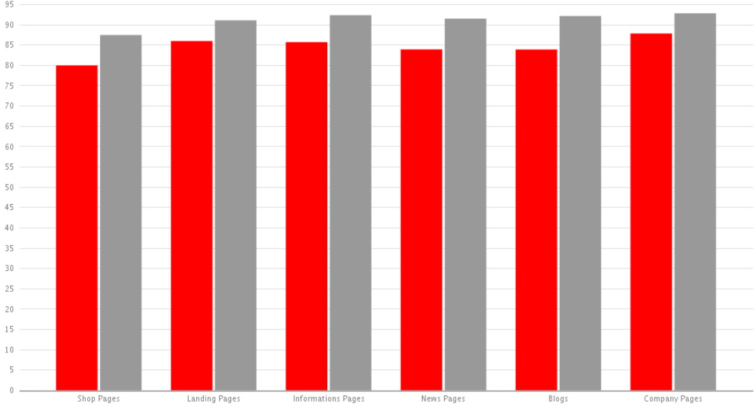
The forecast model of attentional deployment is based on a statistical evaluation of more than 15,000 tested images. The viewing behavior of more than 300 test persons is analyzed to create attentional signatures and to calibrate the model. A comparative study with empirical eye tracking data on the predictive power has found a high correlation of both – empirical data and computed data. While eye tracking studies reached a predictive accuracy (that is, correlation of forecast and effective eye movement) of approximately 90%, automatically created attention analyses reached about 85%.
Predictive power (in percent)
red = EyeQuant model
gray = Eye tracking study
Creating attention analyses
You can create attention analyses based on an uploaded screenshot or a mailing or landing page.
Analyzing a screenshot
Attention analyses have additional costs. For more information, contact customer support.
- In the Attention Analysis window, click New Analysis…. The New Attention Analysis window opens.
- Click Screenshot Upload and then Select.
- Click Browse… and select the screenshot from your local hard disk.
- Optionally, enter a description of the analysis and click Preview.
- If you are satisfied with the screenshot shown in the preview, click Start Analysis.
- Maximum file size: 5 MB
- Supported formats: PNG, JPEG, BMP and GIF
- The image is scaled automatically. This may result in very small images, for instance if the original page orientation is an extreme portrait.
Analyzing an existing mailing or landing page
Attention analyses have additional costs. For more information, contact customer support.
- In the Attention Analysis window, click New Analysis…. The New Attention Analysis window opens.
- Click Mailing then Select.
- In the mailing overview, select the mailing you want to analyze. To analyze a landing page, you must also select the mailing with which it is associated.
- In the Mailing Part to Analyze area, in the list, select the mailing or the landing page. If you have not created any landing pages for your mailing, the mailing is the only option in this list.
- Optionally, enter a description of the analysis and click Preview.
- If you are satisfied with the screenshot shown in the preview, click Start Analysis. After a few seconds, the analysis is available. You can select between the following modes:
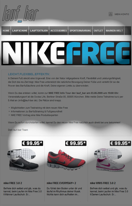
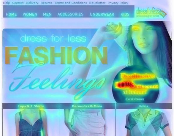
- Perception Map. The first layer of the attention analysis shows which areas gain most attention in the first moments of perception. These areas should contain logos, specially formatted product information, and so on. Small areas mean more focused attention, while larger areas indicate a more dispersed attention. Images with little contrast in color and brightness probably disperse the initial attention more widely.

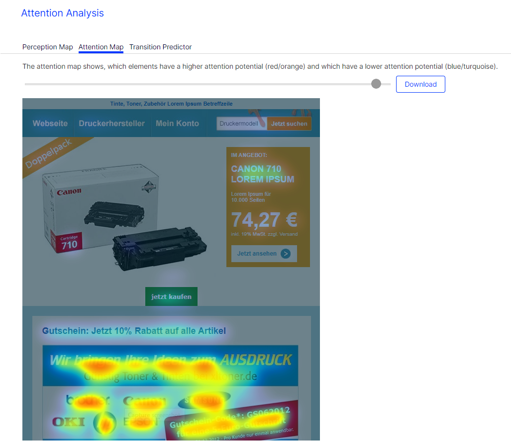
Attention Map. The second layer analyzes the attentional potential of the elements in the overall context of the mailing. Red and yellow areas indicate a high attentional potential, while blue and turquoise areas indicate a low attentional potential. Items with red and blue parts have a high attentional potential, because they are perceived as one item. As said above, a high contrast between an item and the background leads to a more focused attention.
- Perception Map. The first layer of the attention analysis shows which areas gain most attention in the first moments of perception. These areas should contain logos, specially formatted product information, and so on. Small areas mean more focused attention, while larger areas indicate a more dispersed attention. Images with little contrast in color and brightness probably disperse the initial attention more widely.
Attention analysis is based upon universal laws of perception. But some aspects, such as the perception of an image from above left to below right, are cultural patterns so only apply to occidental viewers.
Displaying a previously-generated analysis
- Open the Optimizely Campaign menu and select Analytics > Attention Analysis. The overview displays generated analyses.
- To view the result, click an analysis in the Analyses list, then either Perception map or Attention map.
Interpreting results
Attention analysis gives useful indicators on how to optimize mailings or landing pages:
- Are products you want to promote in the newsletter eye-catchers?
- Is the product information (description, image, price) properly placed and grouped?
- Are the calls-to-action integrated in the perception path, so a viewer can follow them easily?
Too much attention might have a negative impact on the mailing performance:
- Less important items might be more eye-catching than other, more important items.
- The viewer might be distracted by too many items with a high attentional potential.
- Very eye-catching items might appear too blatant for certain recipients.
Optimizing options
- Strong contrasts of fore- and background attract the attention. Contrasts can be achieved through brightness (black/white) and through colors.
- Complementary colors (for example red/green) create a higher contrast and more attention than colors that lie closer in the color space.
- Images are more eye-catching when the background is masked and uncolored (high figure-background contrast).
- The general attention path in the occident goes from the top left to the lower right. You can follow this pattern or break it up intentionally using an eye-catching item.
- The left upper corner gains high attention. Usually, logos are placed here.
- A second area that gains particular attention lies between the left upper corner and center. This area is often the viewer's point of entry.
- Grouping eye-catching items with less eye-catching ones (relative positioning) can heighten the attention for all items. For example, to make an item more eye-catching, place it close to an item that receives a lot of attention.
- To heighten attention for an item, place it in a "calm" environment.
- Less is more. Few eye-catching items may be better than too many. The more eye-catching items you place in your newsletter, the more they compete against each other.
Optimization example
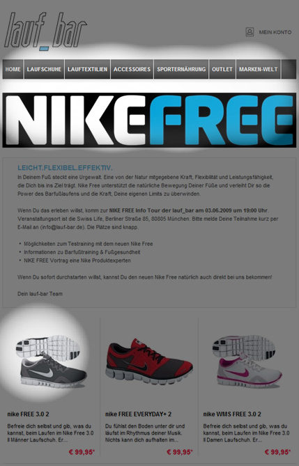
This sample newsletter, at first glance, is clearly structured and well-arranged. The title is eye-catching, but the attention analysis shows that only one of the three promoted products below receives some attention. The product price, although in red, is not focused on by the viewer:
Initial design
The analysis perception map shows a focus on the first product shown.
This is an optimized version of the same newsletter. Some changes are made: The price is positioned closer and top-left to the product. Instead of the red font, an inverted font, similar to the title, is used. These changes cause a significant shift of attention:
Optimized
The perception is equally distributed on the three products – a focus is on the prices.
