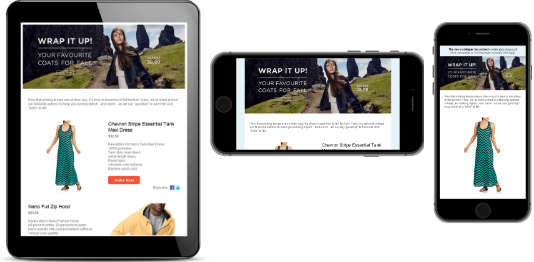
 Mobile Fusion
To enable this feature, contact customer support.
The Mobile Fusion feature makes your newsletter templates fit for mobile devices, such as smart phones and tablets. From a usability perspective, smart phones and tablet PCs are quite different from a traditional computer. Their display sizes are significantly smaller, depending on the type of device. So, the available space should be used optimally.
Scrolling should be limited to vertical, not horizontal. To increase usability, images should be displayed as large as possible, that is "fit-to-screen". Avoid a floating layout or columns. Finally, the newsletter should support the optional switch from portrait to landscape mode by rotating the device.

Checklist for a mobile version of your newsletter
- Layout's minimum width is 320 pixels
- Additional layout for a maximum width of 480 pixels recommended
- Adaption of the layout to full-screen mode
- Images displayed at optimal size
- Single-column layout preferred
- Automatic detection of display width used to adapt the newsletter layout
Adapting your template
You can adapt any message template to a mobile layout. Optimizely offers a full-service adaptation, where you get everything "from scratch". Or, send Optimizely your mobile layout and let us implement it into your template.
Full-service adaptation
- You indicate the template you want to adapt for a mobile version.
- Optimizely creates a layout with flexible widths (two widths, flexible display according to display size) or another layout using fixed width.
- You choose a layout.
- Optimizely implements it into the template.
Benefits
- You get everything from one source and benefit from Optimizely's experience in template design.
- You can be confident that Optimizely's layouts work in your template.
Implementing your own layout
- You indicate the template for which you want to implement a mobile version.
- Optimizely checks if the indicated template is suitable for flexible width or fixed width mobile layout.
- You provide a layout with flexible or a fixed width.
- Optimizely implements the layout into the template.
The mobile layout's e Elements must follow the same order and structure as the HTML layout. For example, you cannot change the position of an image above text to a position within text.
Flexible vs. fixed-width
Ideally, mobile layouts are implemented with a flexible width that adapts to the display size ("fit-to-screen"). The best way to achieve this is a flexible layout using two widths. Any width in between the two is scaled to fit automatically, so the available display space is used optimally. At a defined width between the two defined values, the layout switches from one to the other. Displays with a higher resolution use the regular HTML layout.
For complex template layouts, such as where text is rendered into an image, a flexible width layout cannot be implemented. Optimizely offers a fixed layout width for your mobile version.
| Layout | Width |
|---|---|
| Flexible width | 320 / 480 px |
| Fixed width | 320 px |
The values in the table are default values. If you want different values, contact customer support.