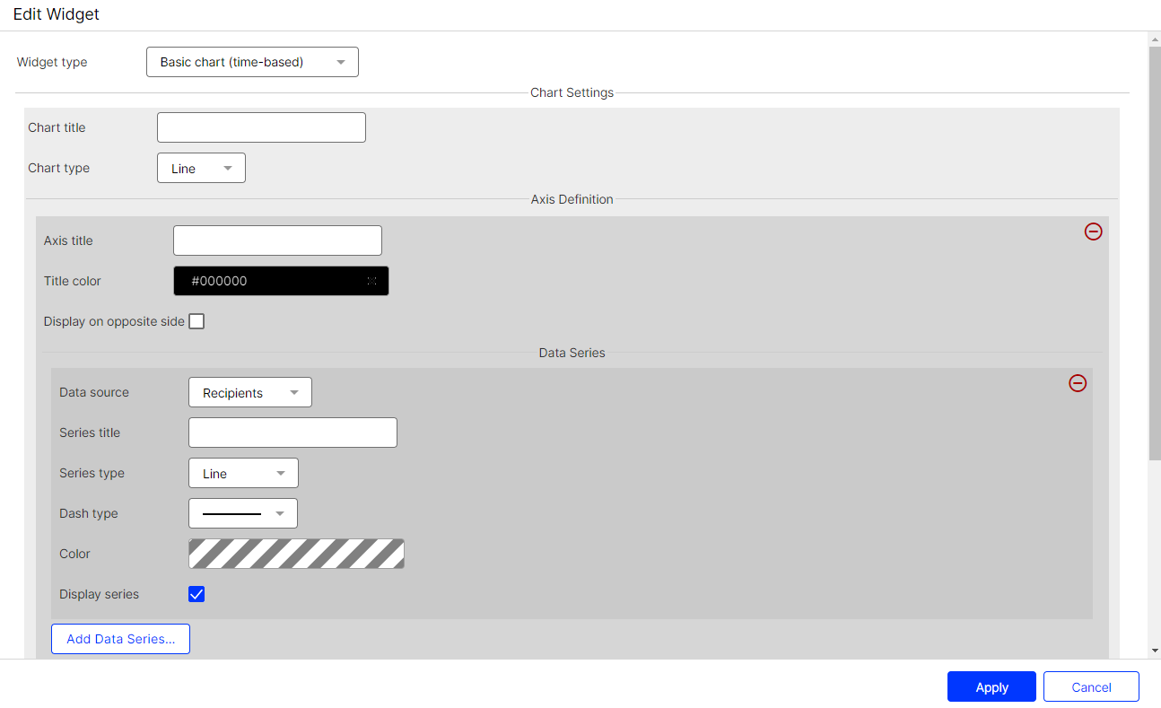
 Basic chart settings (time-based)
In edit mode, double-click a widget or hover over a widget and click Edit  .
.

You can make the following settings:
- Chart title. Title of the chart. It is displayed centered in a predefined font size. Leave the field blank if you do not want to display a title.
- Chart type.
- Bar. Display as bar chart.
- Line. Display as line chart.
- Column. Display as column chart.
- Axis title. Title of the Y-axis of the diagram. Leave the field blank if you do not want to display a title.
- Title color. Select a color for the axis title. Define the font color by entering a hexadecimal value preceded by
#(for example#000000). Alternatively, you can specify a color value using the color selector. - Display on opposite side. By default, the axis title is on the left side. Enable this option to display the axis title on the right side.
- Data source. Select the KPI Stands for "key performance indicator" (also known as a conversion goal); the measurement of actions on web pages. The actions can be completed purchases, pages visited, time spent on site and so on. you want to create a KPI chart for. The KPIs are absolute values and refer to the messages stored in your client.
- Recipients. Number of recipients to whom messages are sent.
- Clicks. Clicked Links.
- Opens. Opened messages.
- Responses. Messages that return to the sending mail server (including reply, autoresponder, hard and soft bounce).
- Unsubscribes. Registered unsubscribes.
- Series title. Enter a significant name for the created chart.
- Series type. Select the display format of the chart.
- Area. Line chart with colored area.
- Area-Spline. Line chart with rounded corners and colored area.
- Column. Column chart.
- Line. Line chart.
- Spline. Line chart with rounded corners.
- Scatter. Values are displayed as separate points.
- Dash type. Select the desired dash type from the drop-down list.
- Color. Select a color for the displayed chart. Define the font color by entering a hexadecimal value preceded by
#(for example#000000). Alternatively, you can specify a color value using the color selector. - Display series. Disable this option to hide the graph. You can reactivate a hidden data series in the Performance Dashboard overview at any time.
- Add Data Series. Click Add Data Series… to add another graph.
- Add Axis Definition. Click Add Axis Definition… to add another Y-axis to the graph. The scale of the new Y-axis depends on the data series you create under this axis definition.
- Time Period Options.
- Add Time Period…. Add a custom time period.
- Title. Enter a name for the newly created period.
- Type. Select whether you want the time period to be absolute or dynamic.
- From/To (Absolute). Specify a start date and an end date.
- From/To (Dynamic). Starting from the current date, specify a time period in days. Use minus values to go back in the past.
- Click Minus
 to remove periods from the selection.
 - Preselected time period. Specify which period is to be displayed by default.
- Display time period selection. Show or hide the drop-down list for time period selection in the Performance Dashboard overview.