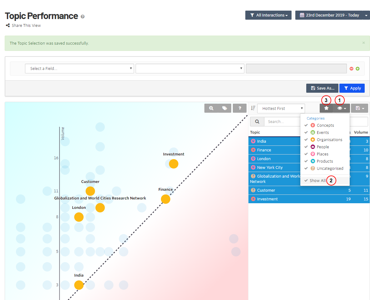
 Topic performance
The Topic Performance view shows a graph of Volume Content Recommendations: The number of content profiles, calculated as unique URLs, into the personalization instance. versus Uniques Marketing Automation: the number of unique IP addresses that visited this page/URL during a specified period.. The view plots topics on the graph that you can select for information about the topic. You also can select a category of topics, which highlights on the graph for easy analysis. You can save selections for later use.
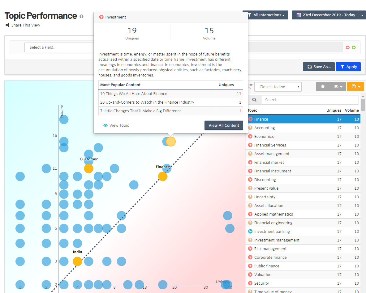
- Yellow dots show topics in the current topic selection that you identified as relevant.
- Blue dots show topics in your content that are not as relevant to your topic selection.
- The Y axis represents the total number of content pieces that contain a particular topic.
- The X axis represents the number of unique visitors that interacted with content that contains a topic.
- The diagonal dotted line represents the ideal amount of content per the number of unique interactions.
- Topics above the dotted line are saturated (meaning you have plenty of content about the subject but fewer people are interested in the topics). You should not focus on these for content production.
- Topics below the dotted line are at a deficit (meaning you do not have enough content about the subject, because people want to know more about the topics). You should increase content production for these topics.
- You can filter and save Interactions views for frequent use, and share a view with a linked URL. Saved filters are shown in the All Interactions menu.
Creating a topic list
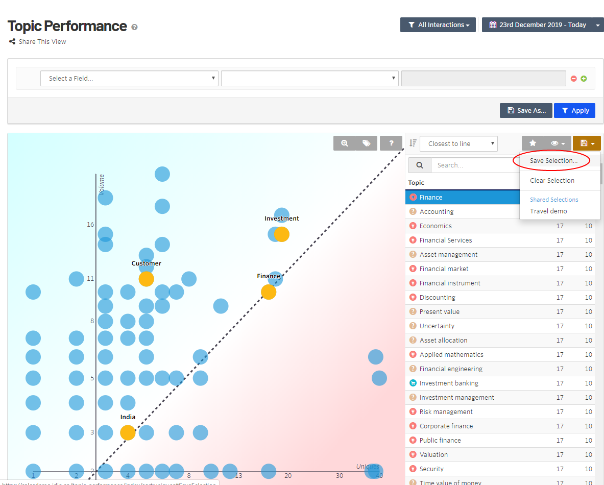
- Click a bubble on the graph, or select a topic from the list, and click Save Selection.
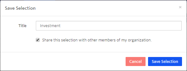
- Enter a title for the selection. Enable the check box to make the selection available to other members of your organization; disable to make the selection for you only.
- You can divide the topic list by category, and add relevant topics from each category to the list. Click View to display the Categories and view each category one at a time, reducing the number of topics displayed on the graph.
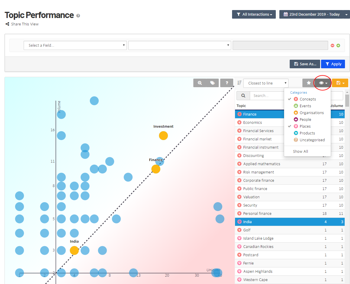
- In each category, select topics that are relevant, such as The top 20 topics, or a selection based on relevance to your brand.
- Click Save to save the topics to your list and select Save {your last saved title}.
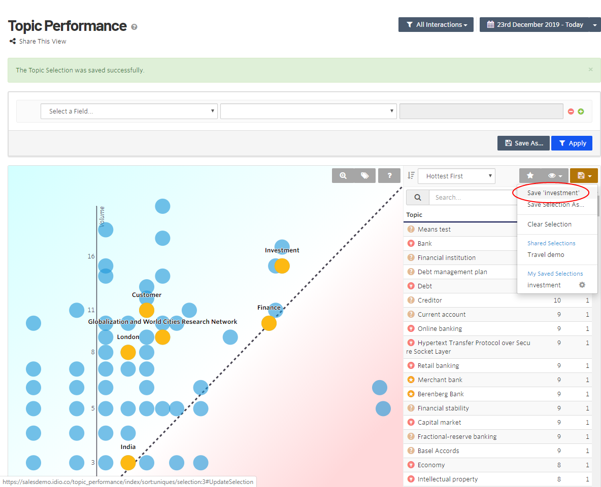
- After you saved all the topics you want, select View > Categories > Show All, then select the Highlight Selected Topics (Star icon) to include or remove all other topics from the dashboard. The graph displays your chosen topics from all categories by "hottest first" topics.
